We undertook an exploratory rebrand for Liberty Travel to evolve their decades-old travel agency into a modern, digitally-driven brand. Founded in 1951 as one of the first companies to provide complete vacation packages, Liberty Travel has become disconnected from the needs of today’s travelers. Our objective was to envision an updated brand identity and web presence that would resonate with modern families, couples, and adventure seekers looking for the perfect vacation while honoring Liberty’s longstanding heritage.
CHALLENGE
Upon first look, Liberty Travel’s longstanding brand identity and website design felt outdated and corporate. Their branding resembled an insurance company more closely than a modern, customer-focused travel agency. Additionally, their previous website needed more intuitive navigation and compelling lifestyle visuals.
INSIGHTS
Upon first look, Liberty Travel’s longstanding brand identity and website design felt outdated and corporate. Their branding resembled an insurance company more closely than a modern, customer-focused travel agency. Additionally, their previous website needed more intuitive navigation and compelling lifestyle visuals.
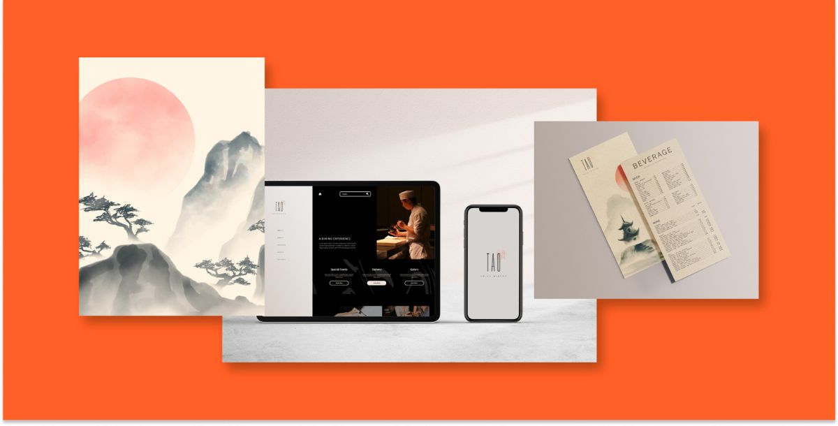
By strategically refreshing Tao Asian Bistro’s visual identity throughout their social media, website & restaurant, a transformative atmosphere would begin to take shape.Pairing the new visual identity with a fresh campaign, targeting foodies who seek elevated ambiance and cuisine, would help to increase brand awareness and drive growth in the competitive dining scene.
SOLUTION
Informed by these insights, we conceptualized a vibrant, multicolored brand identity, drawing inspiration from destinations consumers hope to explore. Liberty’s new logo features a stylized compass icon that evokes a sense of discovery.
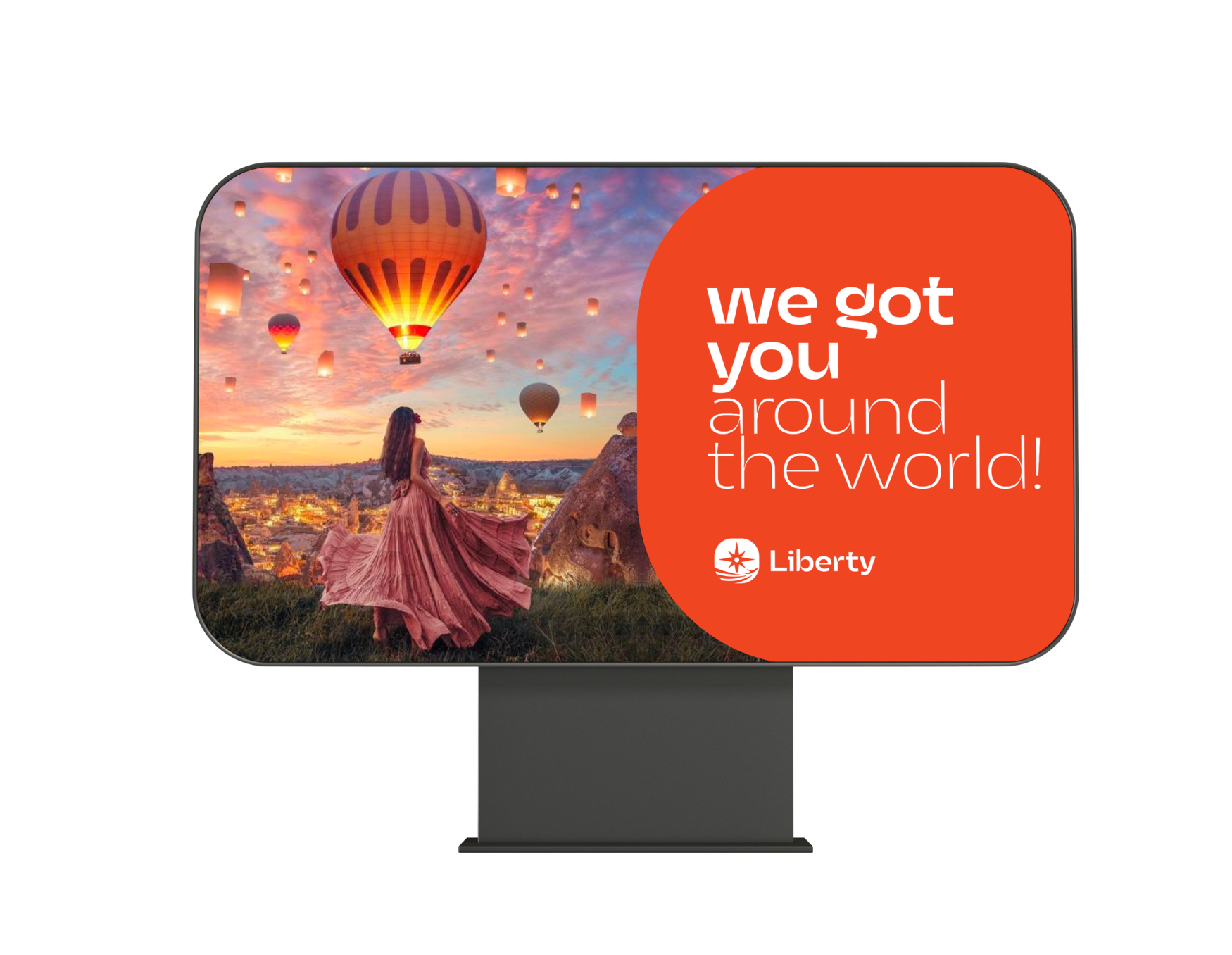
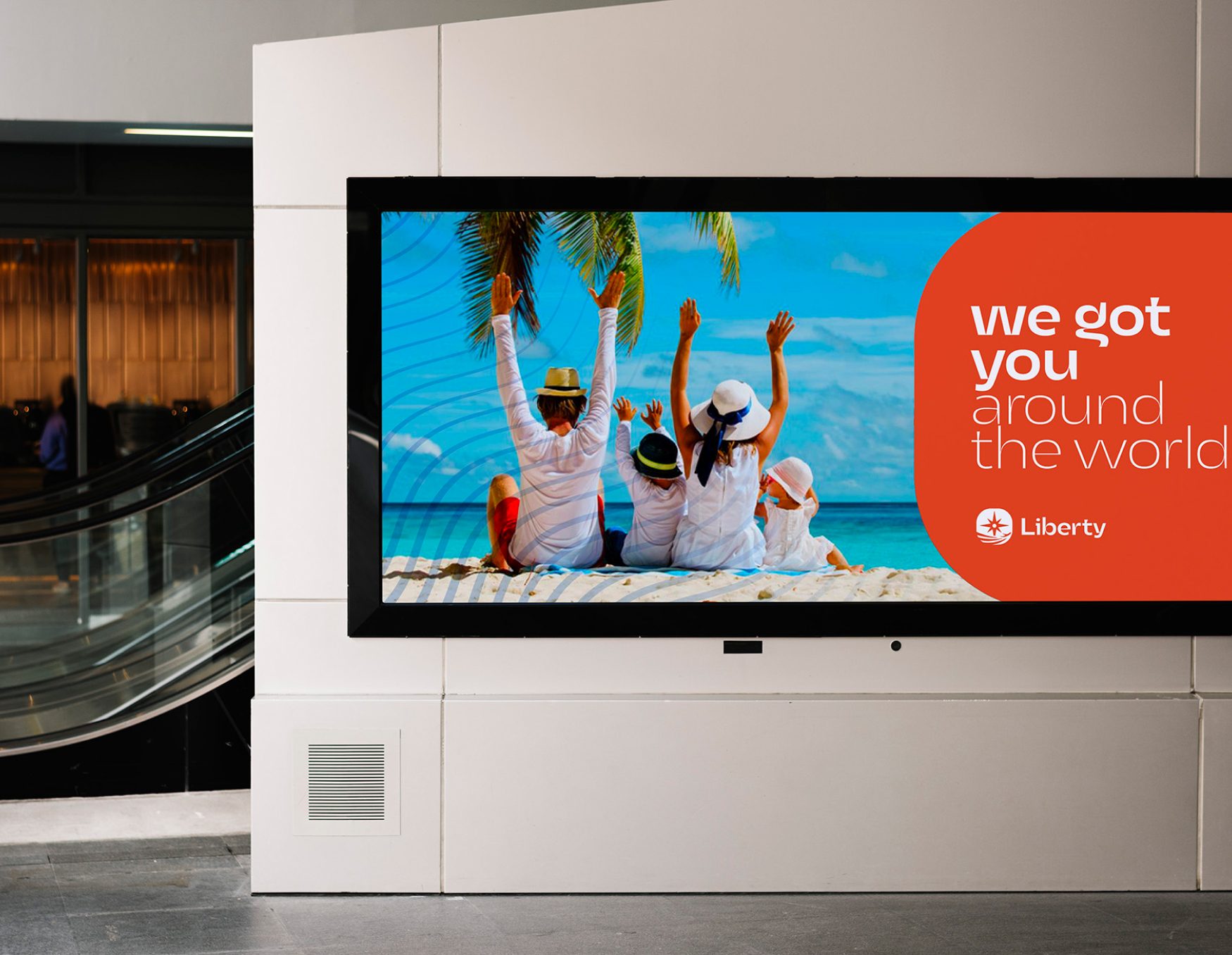
Leveraging bold, vibrant visuals from the rebrand across out-of-home advertising like billboards, transit posters, and airport signage would attract and inspire travelers in major markets. Strategically placed dynamic billboards showcasing stunning destination imagery at transportation hubs could capture interest and drive traffic to Liberty’s reinvented site to book unforgettable getaways.
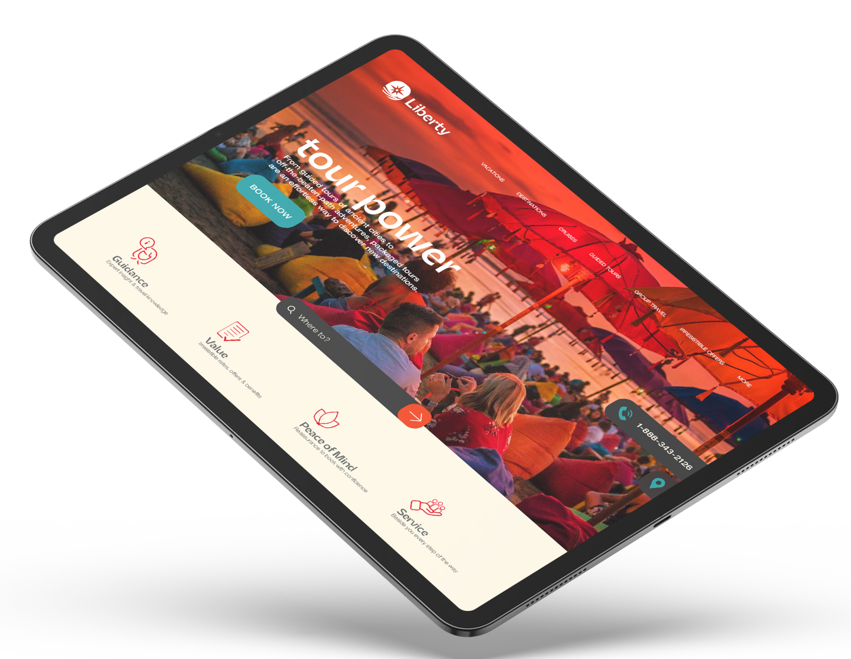
We recommend building enhanced country/region pages with weather info, cultural overviews, suggested itineraries, and photo/video galleries to showcase destination inspiration. Implementing a streamlined information architecture with intuitive booking flows and responsive page design would create a user-friendly experience. A reinvented blog would provide tips and stories from Liberty’s expert travel advisors. Integrated trip planning tools allow customers to assemble flights, hotels, transportation, tours, and more into a personalized trip package. Interactive maps enable filtering by budget, interest, and travel style.
The site could highlight special offers such as resort credits, room upgrades, and exclusive amenities.
Our creative rebrand and digital-first approach would enable... while retaining their heritage as a long- standing travel agency, serving the travel industry for over 70 years.
Our creative rebrand and digital-first approach would enable... while retaining their heritage as a long- standing travel agency, serving the travel industry for over 70 years.
At Uncomn Projects, we take pride in transforming brands and exceeding expectations. The Liberty Travel project is a testament to our commitment to creating captivating, customer-centric brand experiences in the ever-evolving world of travel.
Creative
Logo
Responsive Website Design
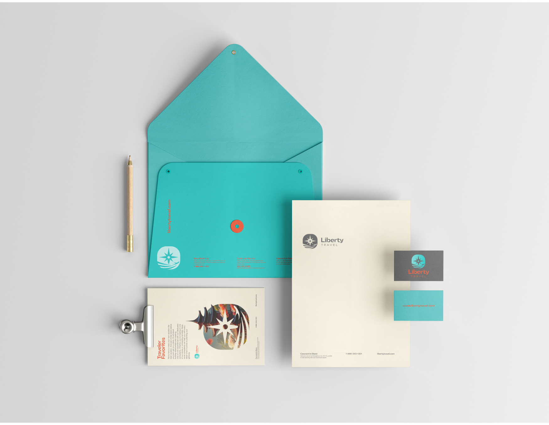
Stationary
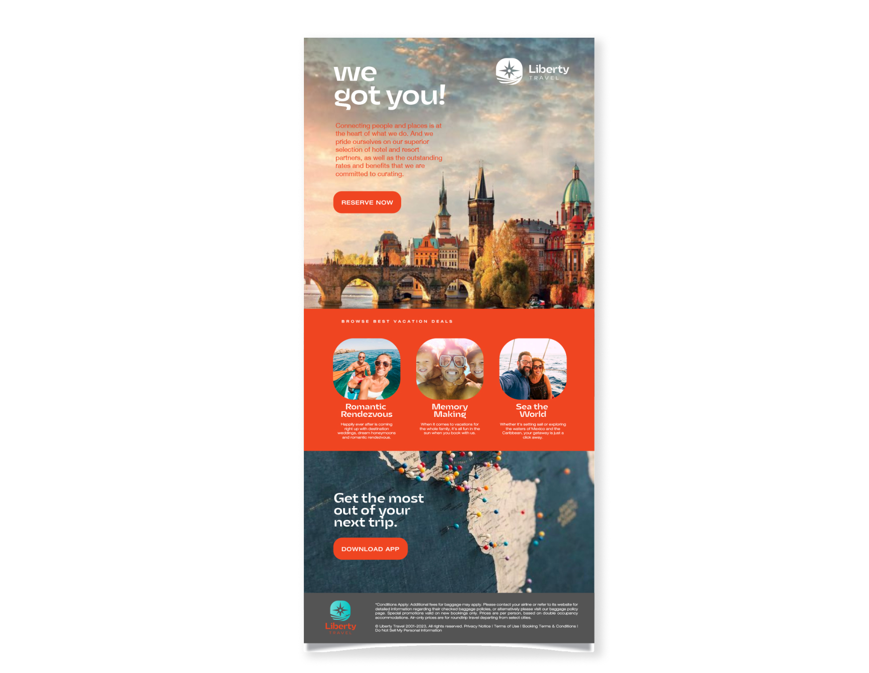
Email Marketing
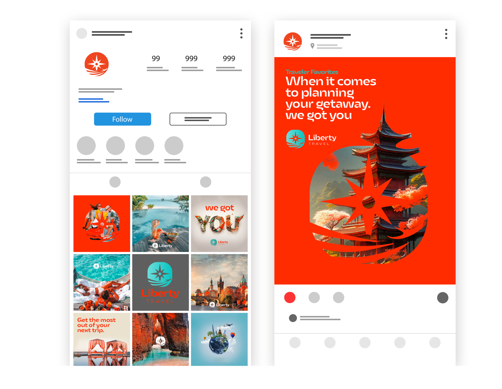
Social Media
Paid Advertisement
Billboard
Symbolic Brand Mark
The new Liberty Travel logo mark centers on a compass, representing guidance and discovery. A plane flies over the compass, symbolizing embarking on thrilling new journeys. Below the compass is the reflection of the sun glistening on water, evoking images of exotic destinations. Together, these three elements – the compass, plane, and sun reflection – encapsulate the spirit of adventure, freedom, and new horizons at the heart of the Liberty Travel experience. The logo captures their enduring passion for helping travelers explore the world’s beauty.
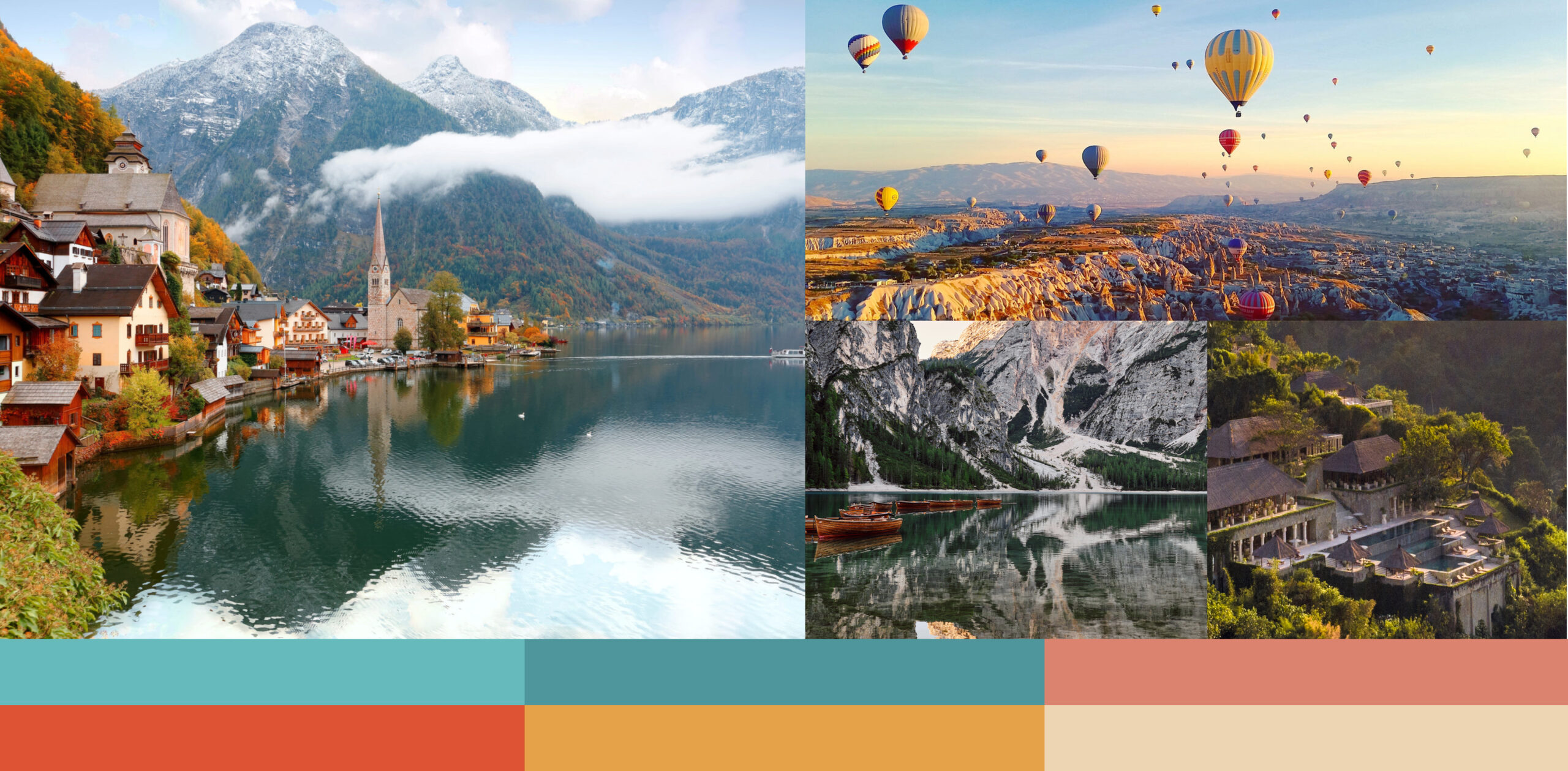
The photography combines sweeping destination landscapes with lively lifestyle images. Vibrant colors and real travelers immerse site visitors in the spirit of discovery Liberty facilitates.