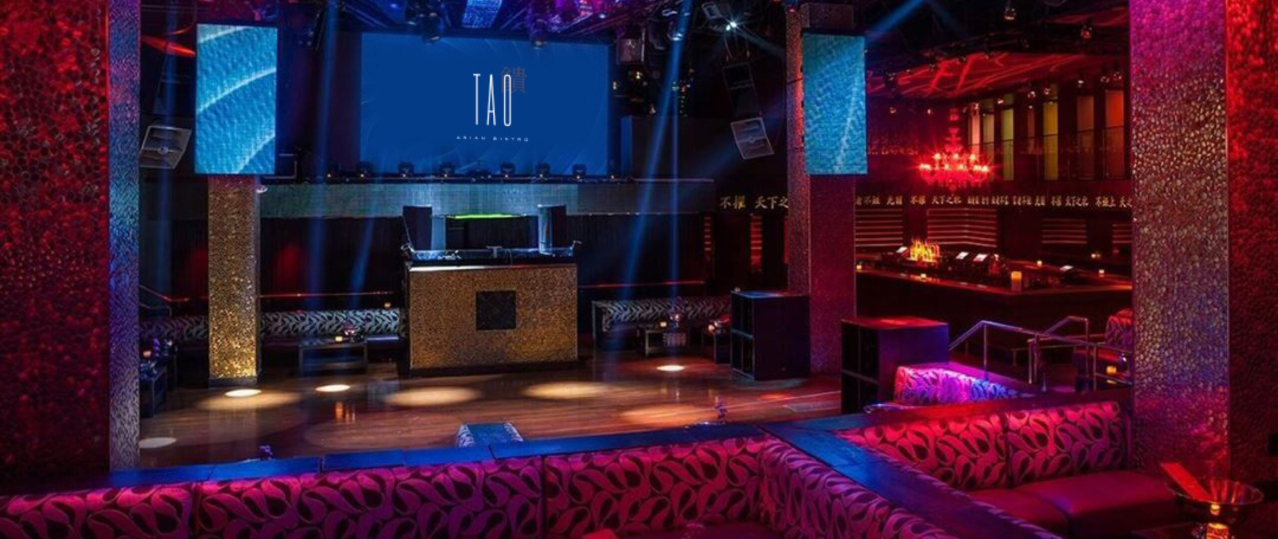
Located inside The Venetian Resort and Casino, Tao Asian Bistro is an unparalleled restaurant in the heart of the Las Vegas Strip. It transports guests from Las Vegas into a pan-Asian experience, complete with a Japanese Koi-filled infinity pool, lush silk draperies, and century-old stones to complete the incredible ambiance. Every table in the 400-seat, two-level dining area is placed under the watchful eyes of a 20-foot Buddha statue, whose presence ensures every guest departs feeling completely satisfied. While the experience is like no other, Tao Asian Bistro’s current brand is not differentiated from its parent company, Tao Group.
Uncomn Projects’ rebrand clearly showcases Tao Asian Bistro as a refined, one-of-a-kind restaurant experience for epicures. It has the potential to successfully elevate perceptions and drive increased reservations, it also distinguishes Tao Asian Bisto’s own identity within Tao Group’s portfolio of other notable restaurants and nightclubs. By differentiating itself from the conglomerate, Tao Asian Bistro comes to life in a whole new way.
CHALLENGE
Although renowned for its ambiance and cuisine, Tao Asian Bistro’s current branding is too similar to Tao Group’s corporate branding. This results in a lively atmosphere that is misaligned with the restaurant’s upscale dining experience and Asian-inspired sophistication. Aside from Tao’s similarity to its parent company in logo & branding, additional areas for improvement upon first glance include tired visuals conveying nightlife rather than the culinary art occurring in a dynamic atmosphere.
Our challenge was to differentiate Tao Asian Bistro’s brand architecture to reflect better its elevated cuisine, sophisticated ambiance, and exceptional service.
INSIGHTS
Comprehensive market research & analysis shows that a large demographic of diners are looking for a refined yet lively ambiance – no matter the cuisine. Competitors like Zuma and Nobu succeed by blending vibrant energy with culinary sophistication.
By strategically refreshing Tao Asian Bistro’s visual identity throughout their social media, website & restaurant, a transformative atmosphere would begin to take shape.Pairing the new visual identity with a fresh campaign, targeting foodies who seek elevated ambiance and cuisine, would help to increase brand awareness and drive growth in the competitive dining scene.
This refined the restaurant in an elegant appeal to the target demographic
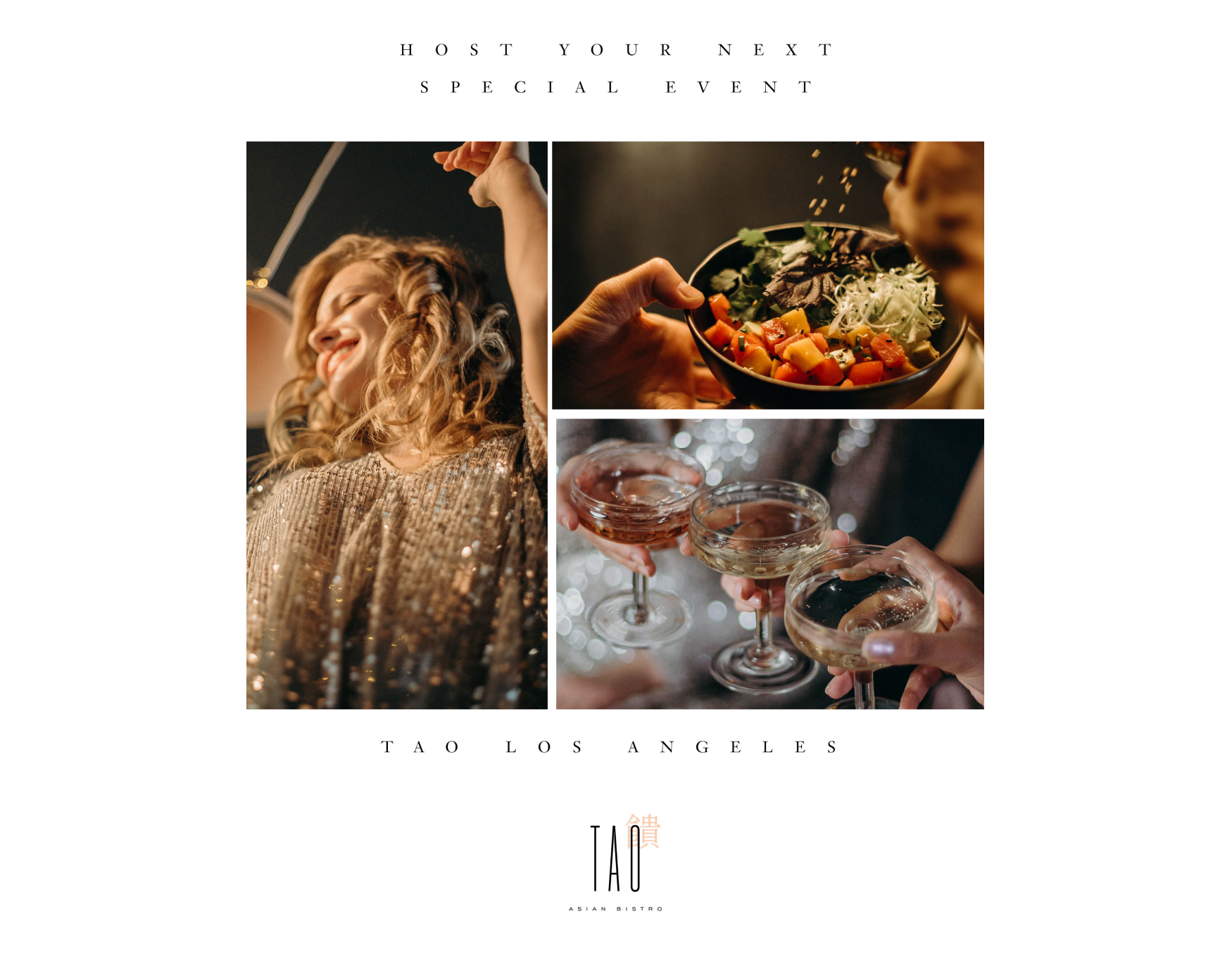
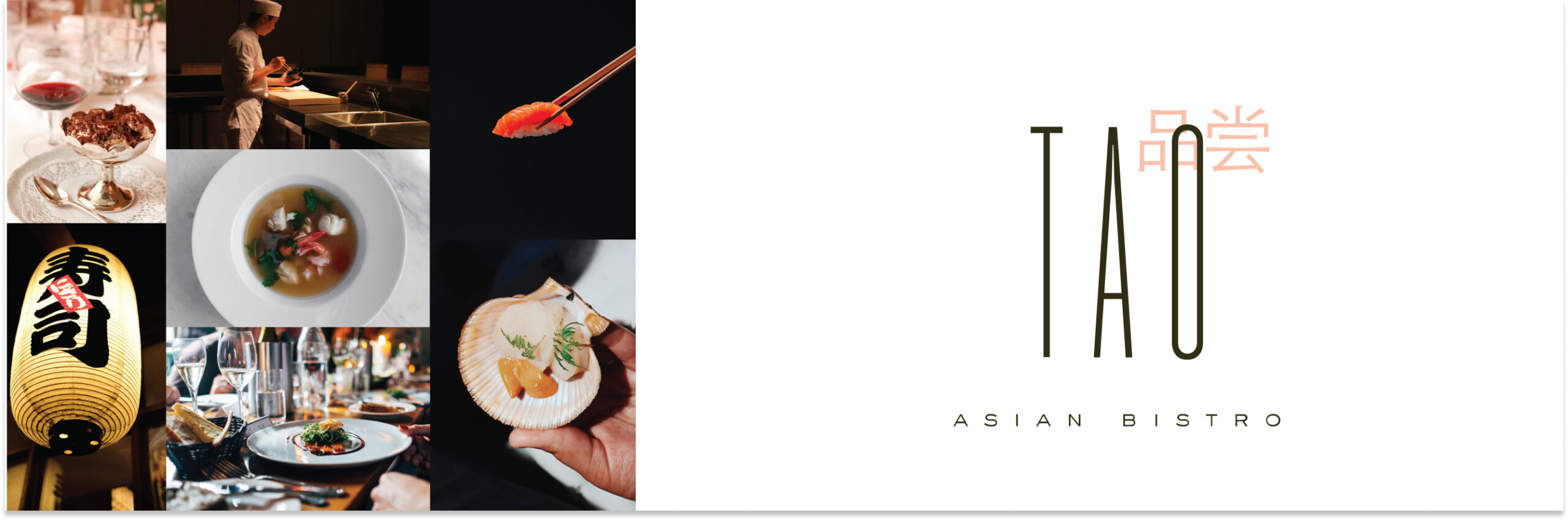
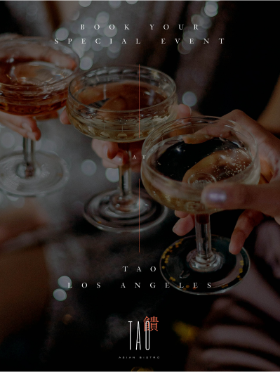
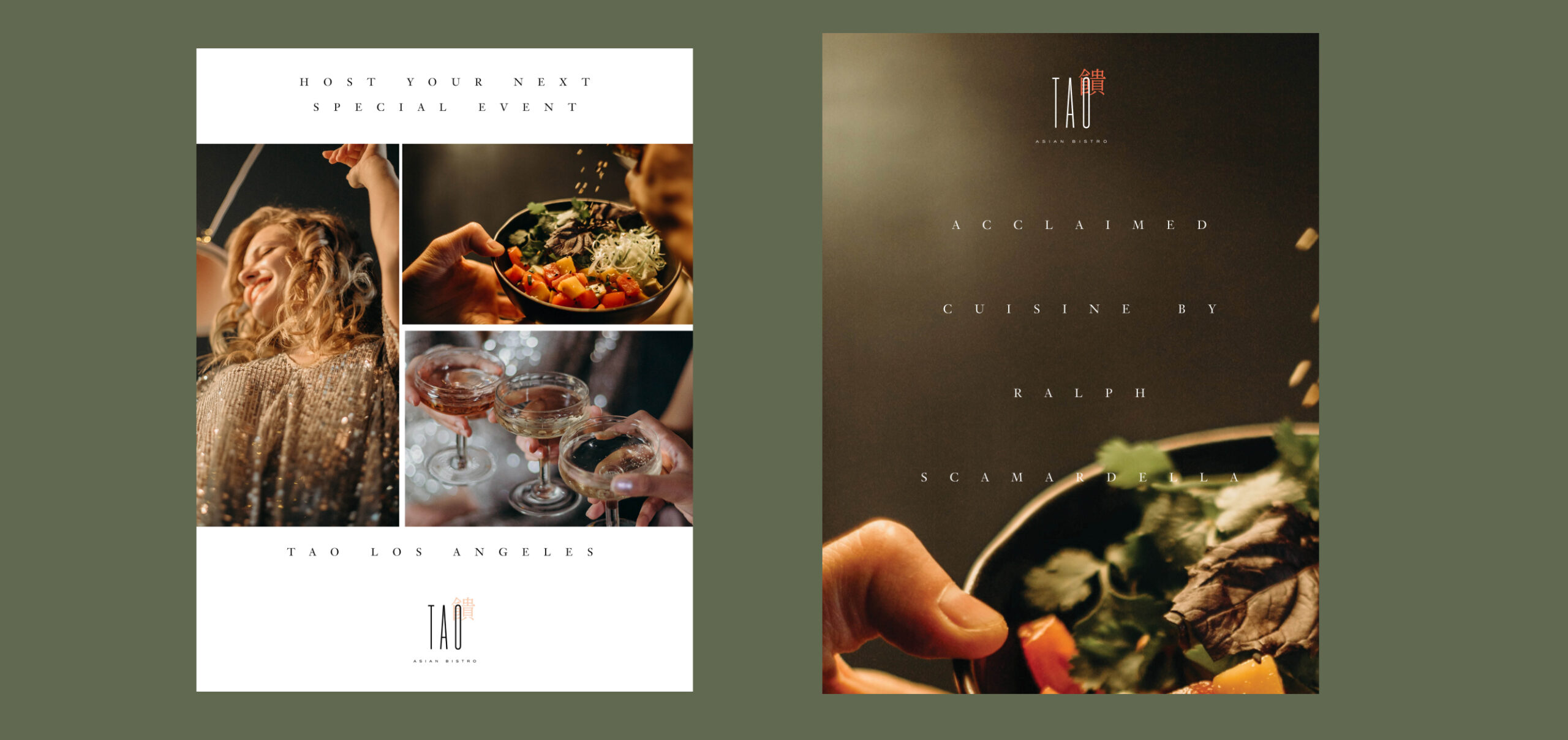
Uncomn Projects knows the impact of photography, especially when it comes to foodies. Through vivid photography of cocktails and signature dishes, we targeted several consumer profiles successfully – the foodie, the high-end elite and the ambiance seeker. The user experience focused on ease of reservations and menu exploration. Accenting colors from the brand palette reinforced the visual identity to align with the personal experience when visiting the restaurant.
Social media content highlights Tao’s culinary offerings with appetizing imagery and behind-the-scenes views of the kitchen. The three custom icons representing “Savor,” “Eat,” and “Drink” brought brand personality to platforms like Instagram and Facebook while supplying brand messaging to the target audience.
This strategic rebrand differentiates Tao as a one-of-a-kind Asian dining experience. The new visual identity and engaging content accurately conveyed the sophistication and elegance of the restaurant. The branding better reflected the exceptional ambiance, cuisine, and service. We wanted to draw focus to the vibrant yet appetizing hues that can be seen on a plate when dining at Tao Asian Bistro.
When implemented, this strategic rebrand has the potential to boost reservations and reviews highlighting Tao Asian Bistro’s exceptional dining experience. Our approach demonstrates how we could transform Tao Asian Bistro’s visual identity and perception to match their unique cuisine and atmosphere.
Creative
Logo & Icon Development
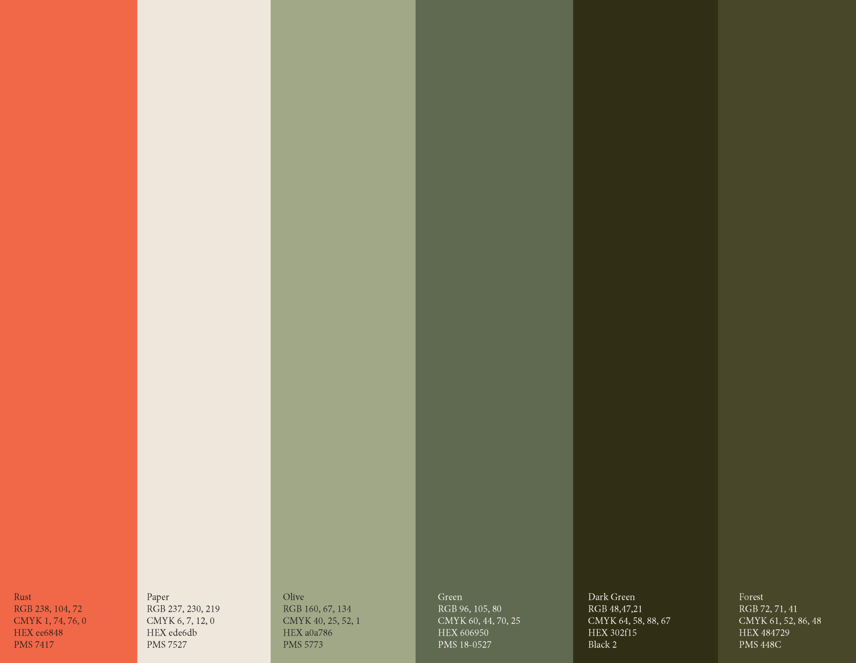
Color Palette Curation
Pattern Development
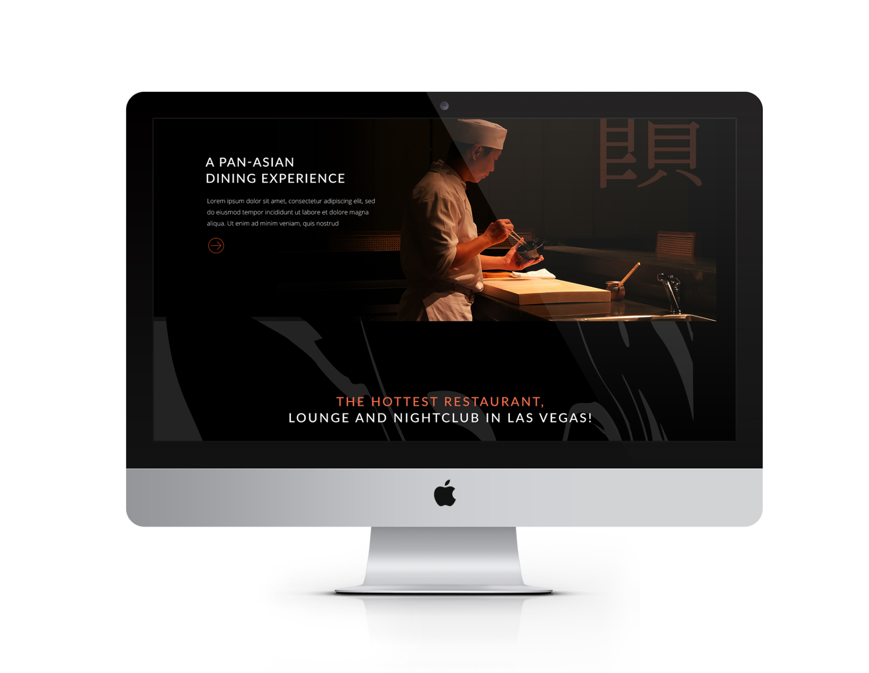
Website Design & Development
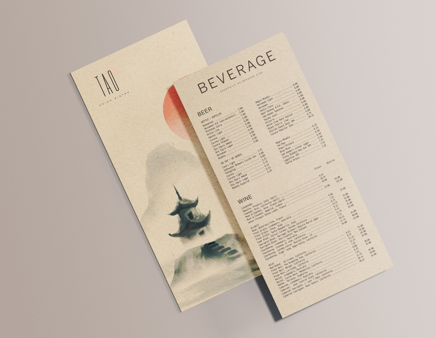
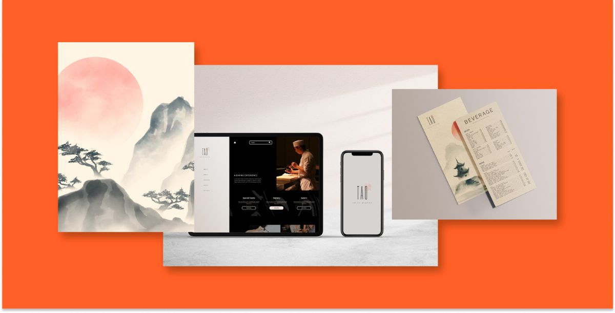
Menu
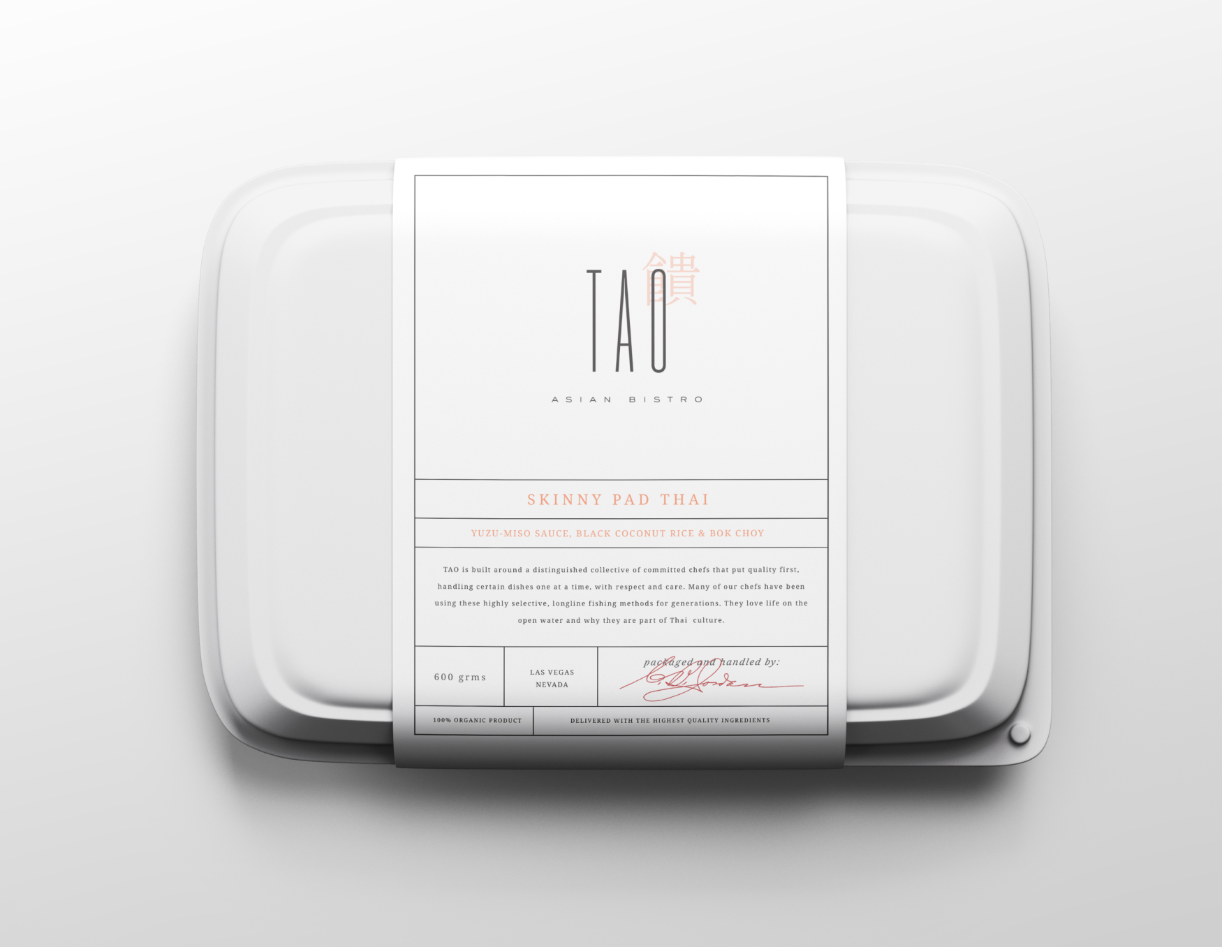
Take-out Containers
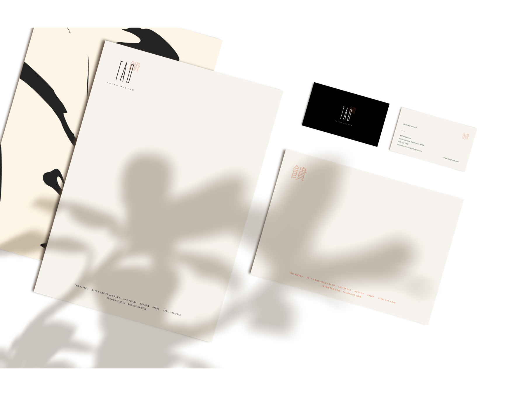
Stationery
Custom Interior Wall Paper
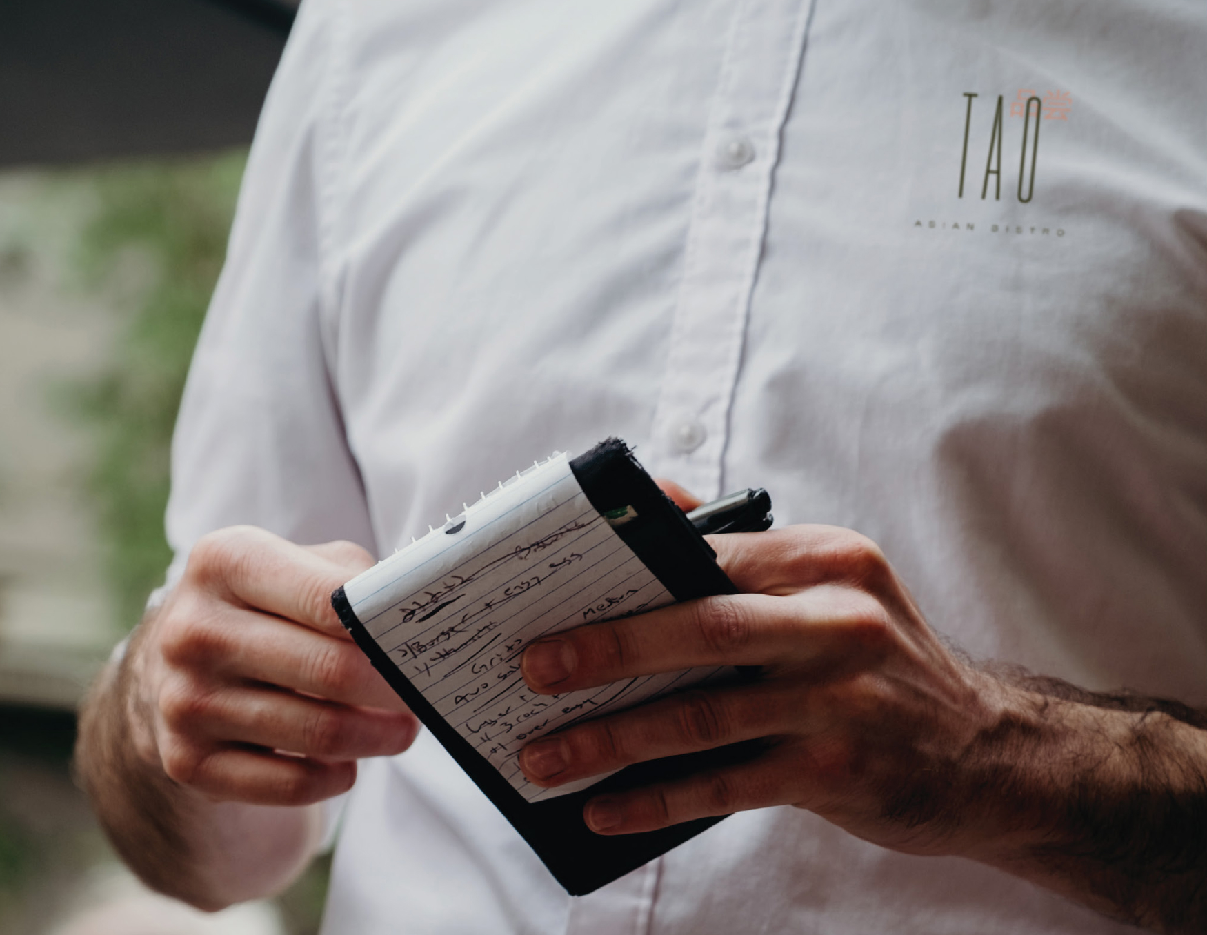
Restaurant Uniform
Display Ad
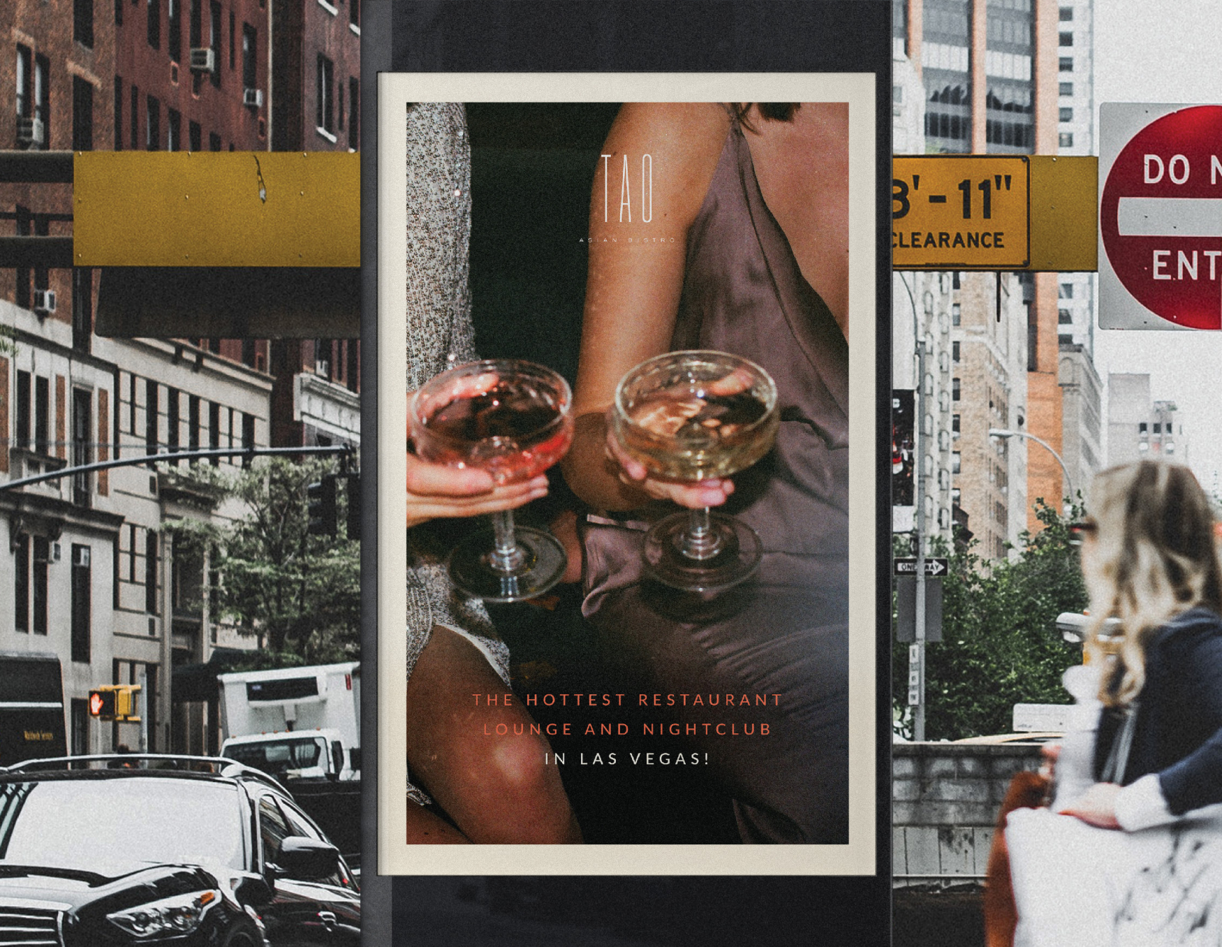
Out-of-home Advertising
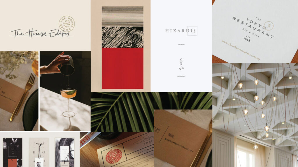
Inspired Sophistication
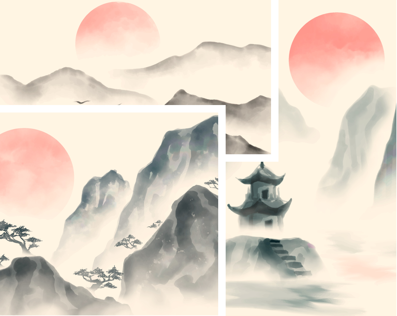
Uncomn drew inspiration from elegant imagery pairing sophistication with bold pops of color. Luxe interiors and artistic details nodded to Asian heritage, accented by vibrant hues inspired by both nature and the cuisine served at Tao. The goal was to encapsulate Tao’s refined yet lively atmosphere with a sophisticated lens.
A Nod to Culture
Tao’s new logo brilliantly blended modern and traditional Asian influences. The wordmark utilized sophisticated letterforms accented by the Mandarin symbol for “savor,” establishing cultural roots. The characters for “eat” and “drink” were carried through as printed motifs, further nodding to heritage. Soft watercolor textures and fluid brushstroke patterns added a layer of Asian-inspired serenity and artistry.
Designed to Resonate
Creative email graphics, flyers and social media posts all tastefully use the updated brand to capture the attention of Tao’s target audience.
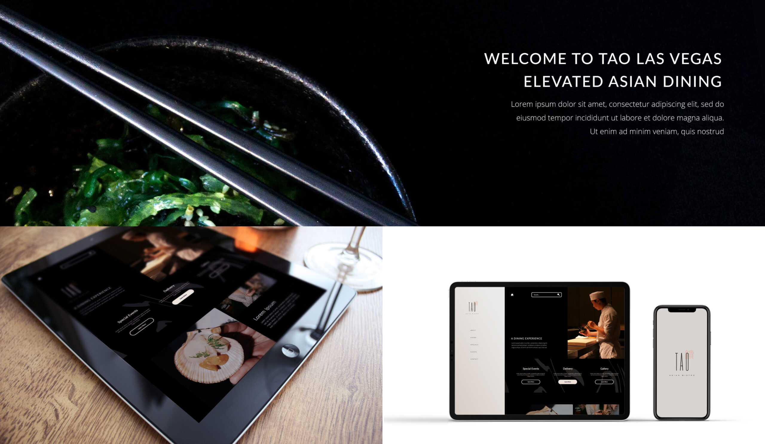
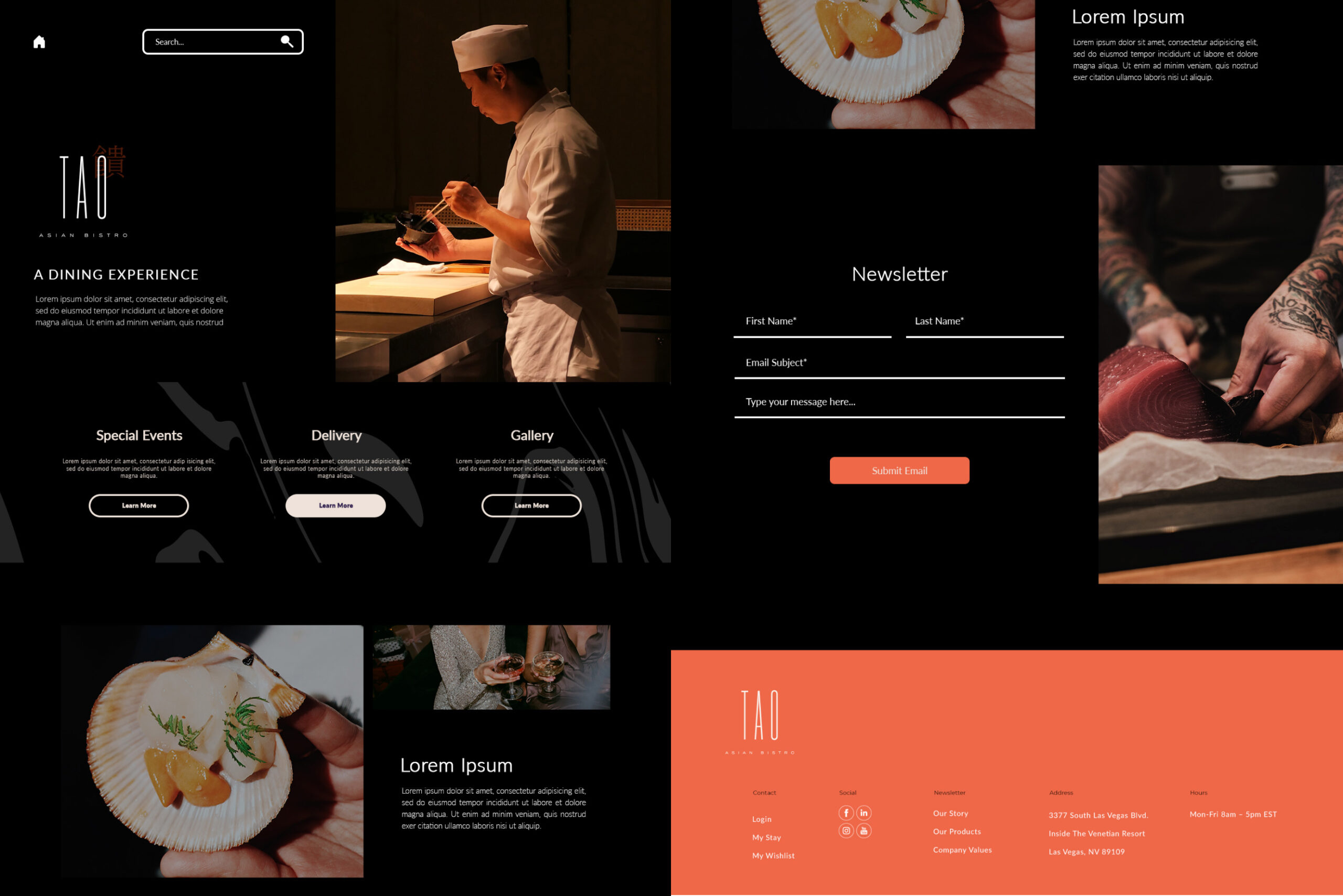
An Elevated Online Experience
Tao’s website and newsletter were reimagined to offer a streamlined and engaging experience. The new website boasts user-friendly navigation, making it easy to explore Tao’s extensive menu, make reservations, and stay informed about the latest updates on Tao’s culinary offerings and events. Meanwhile, the redesigned newsletter adds an element of sophistication, delivering Tao’s world to subcribers’ inboxes.