Before the word took on a new meaning in the fitness industry, the term “peloton” referred to two or more cyclists biking together. The Peloton brand is now a household name known for kickstarting connected fitness inspired by the idea of togetherness. Their roots are in cycling, specifically stationary bikes marketed to busy on-the-go individuals looking for at-home workout solutions. While they have expanded into on-demand fitness and enhanced their product selection, we felt that the brand had the potential to expand even further into the wellness space. To put their brand back in conversation with other at-home, on-demand apps, and services, Uncomn explored a new identity for Peloton.
We concepted an integrated rebrand campaign that could reframe Peloton into an inclusive, aspirational lifestyle and wellness brand. We aimed to comprehensively showcase Peloton as an innovative leader in immersive, at-home fitness experiences for all workout types, ability levels, interests, and demographics.
CHALLENGE
As a creative agency, Uncomn Projects is constantly looking for untapped potential, so Peloton caught our eye. Beyond the cycling niche, we saw an opportunity for them to speak to a broader wellness audience. Though recognized for premium equipment, evoking intensity over accessibility, we felt Peloton had the ingredients to become an inclusive, aspirational wellness brand. If strategically repositioned through research and integrated storytelling, Peloton could shift perceptions from intimidating to inspiring. A rebrand celebrating their expertise in creating powerful fitness communities would light the path for Peloton to transform into a lifestyle brand, partnering with their consumers to help them reach their goals and be their best selves – wherever their fitness journey might take them.
INSIGHTS
Looking beyond the cycling community, our research revealed a strong demand for flexible, on-demand workouts extending far beyond equipment-based exercises. Though known for premium hardware and motivational cycling content, Peloton’s true strengths are accountability, expertise, and collective inspiration. These intangibles showed tremendous potential to engage broader audiences if anchored to a lifestyle brand positioning. Peloton’s minimalist aesthetic provided a polished starting point to build an inclusive, immersive wellness experience. But truly realizing that opportunity would require embracing personalization, diversified content, and omni-channel engagement. Repositioned through insights and inclusivity, Peloton could become so much more than a luxury bike brand.
SOLUTION
Seeing an opportunity for growth, our team reimagined Peloton as an inclusive, empowering wellness brand. Through competitive analysis, we identified pathways for Peloton to expand beyond premium cycling into broader fitness and lifestyle content. To evolve their brand positioning, we focused on showcasing the diversity of Peloton’s existing products & services and its potential to motivate every fitness journey. We developed an energetic, geometric visual system designed to make premium wellness feel attainable.
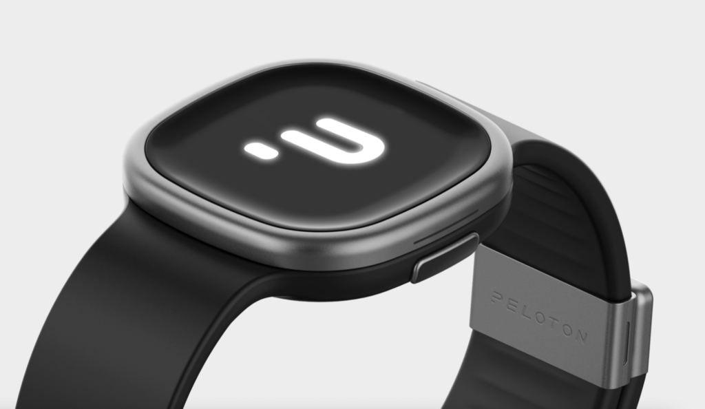
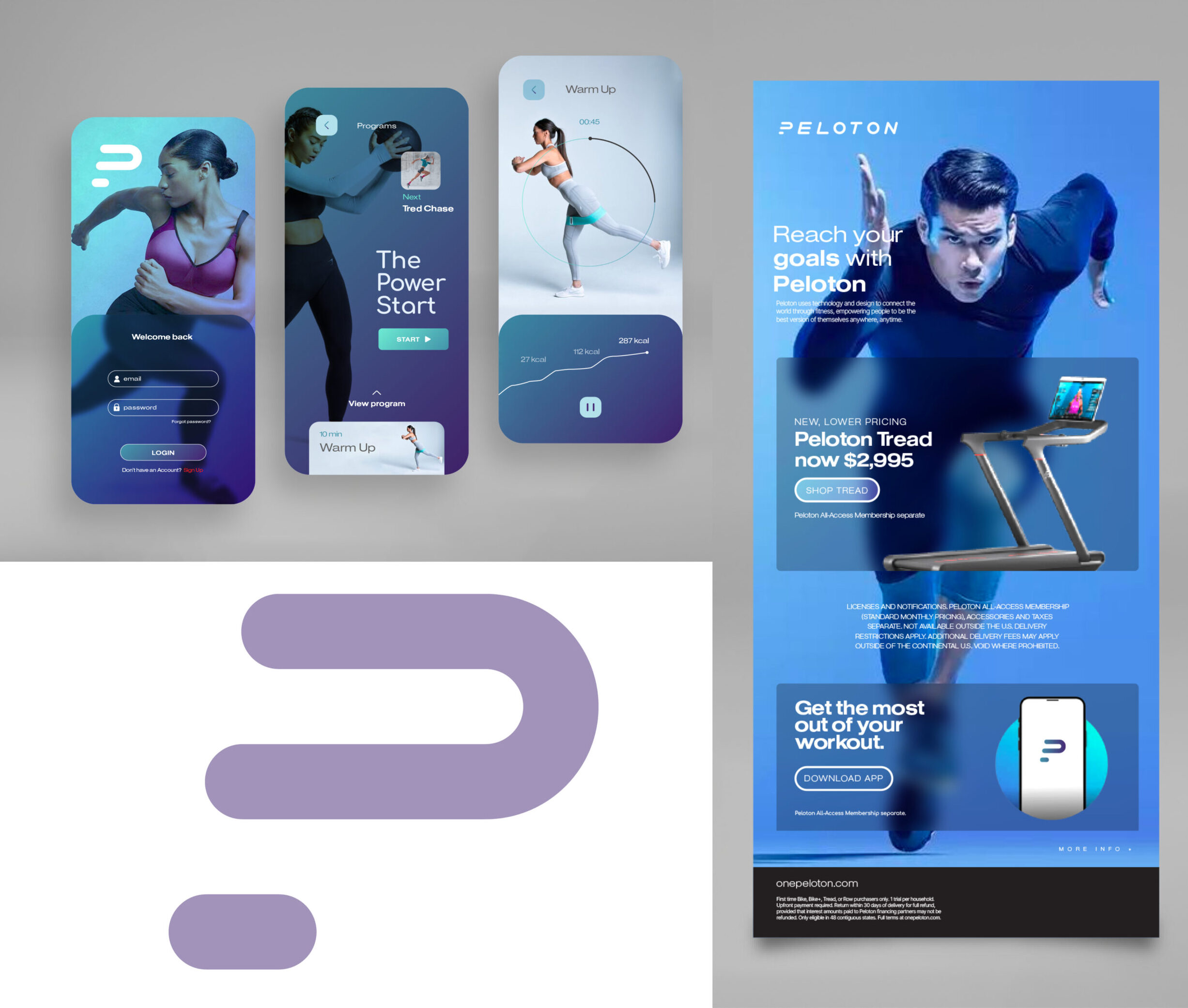
The existing icon transformed into a more inclusive logo, showcasing a monogram that seems to be set in motion.
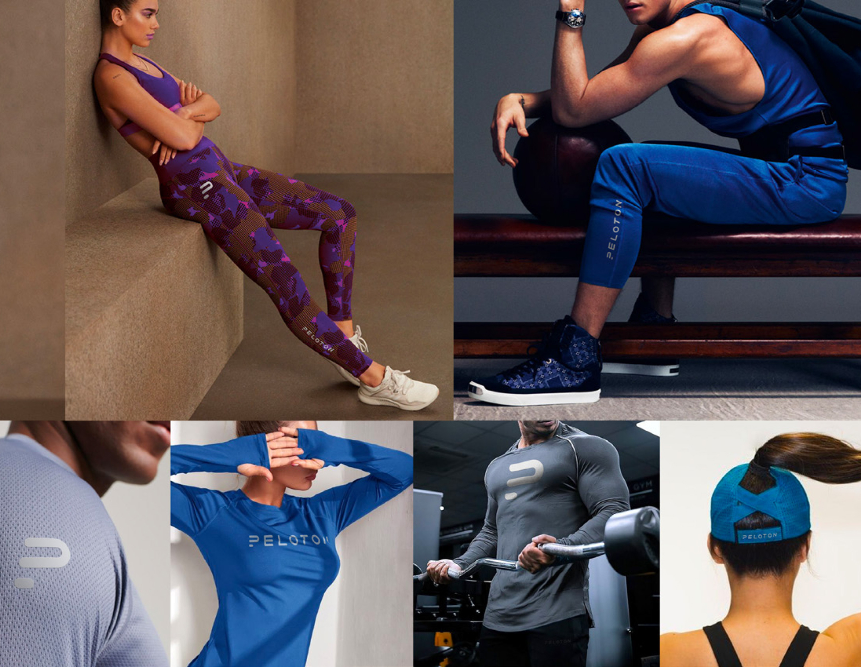
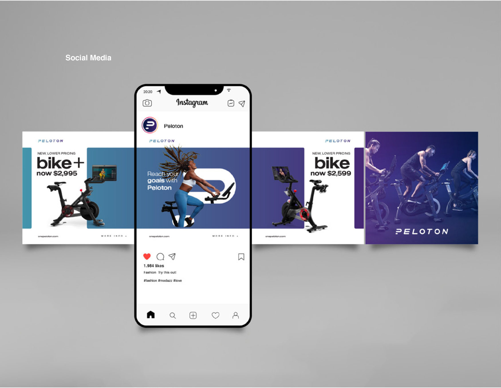
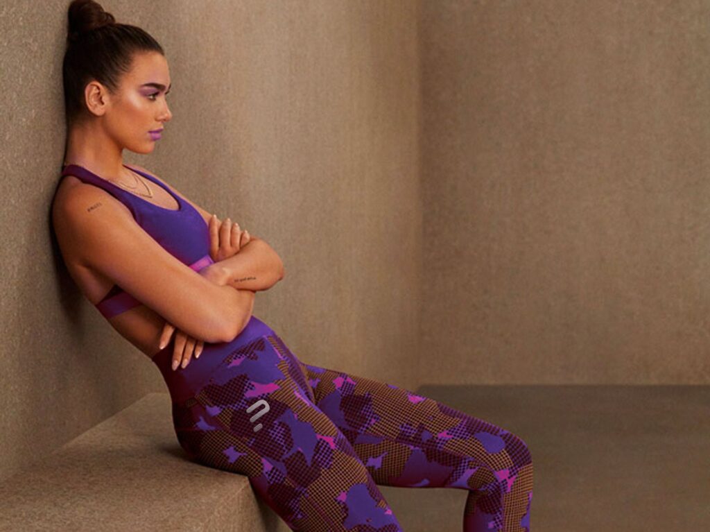
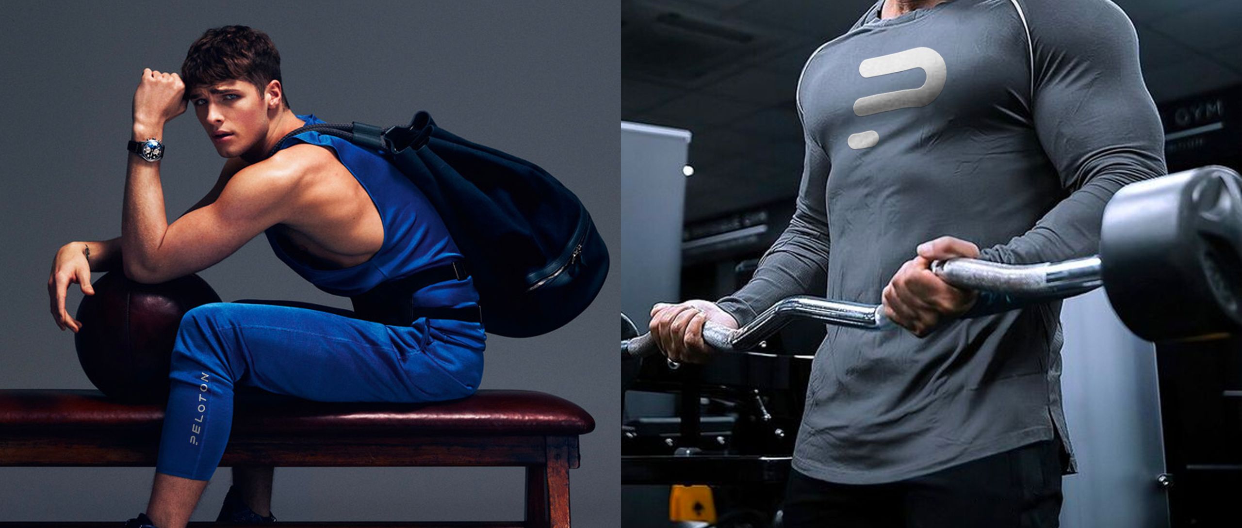
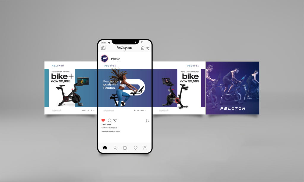
Condensed fonts and vibrant colors communicate a refreshing, welcoming feeling. The brand featured photography that captured movement in a way that felt 3D, almost leaving the page, with a bold color treatment overtop. Ongoing digital marketing, social media community building, search optimization, and data-driven advertising would help Peloton continue engaging new audiences and cementing its status as the ultimate destination for flexible, personalized home workouts.
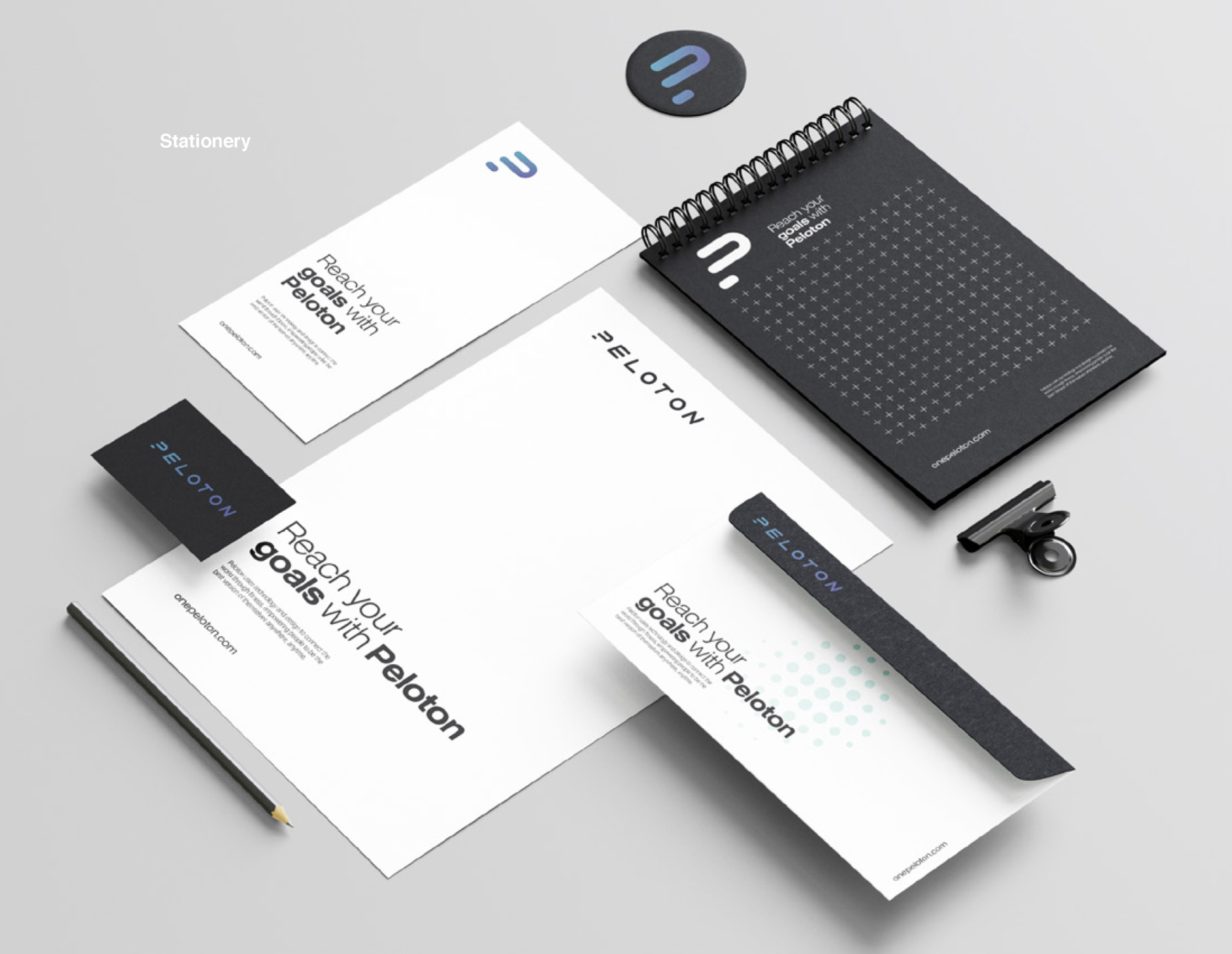
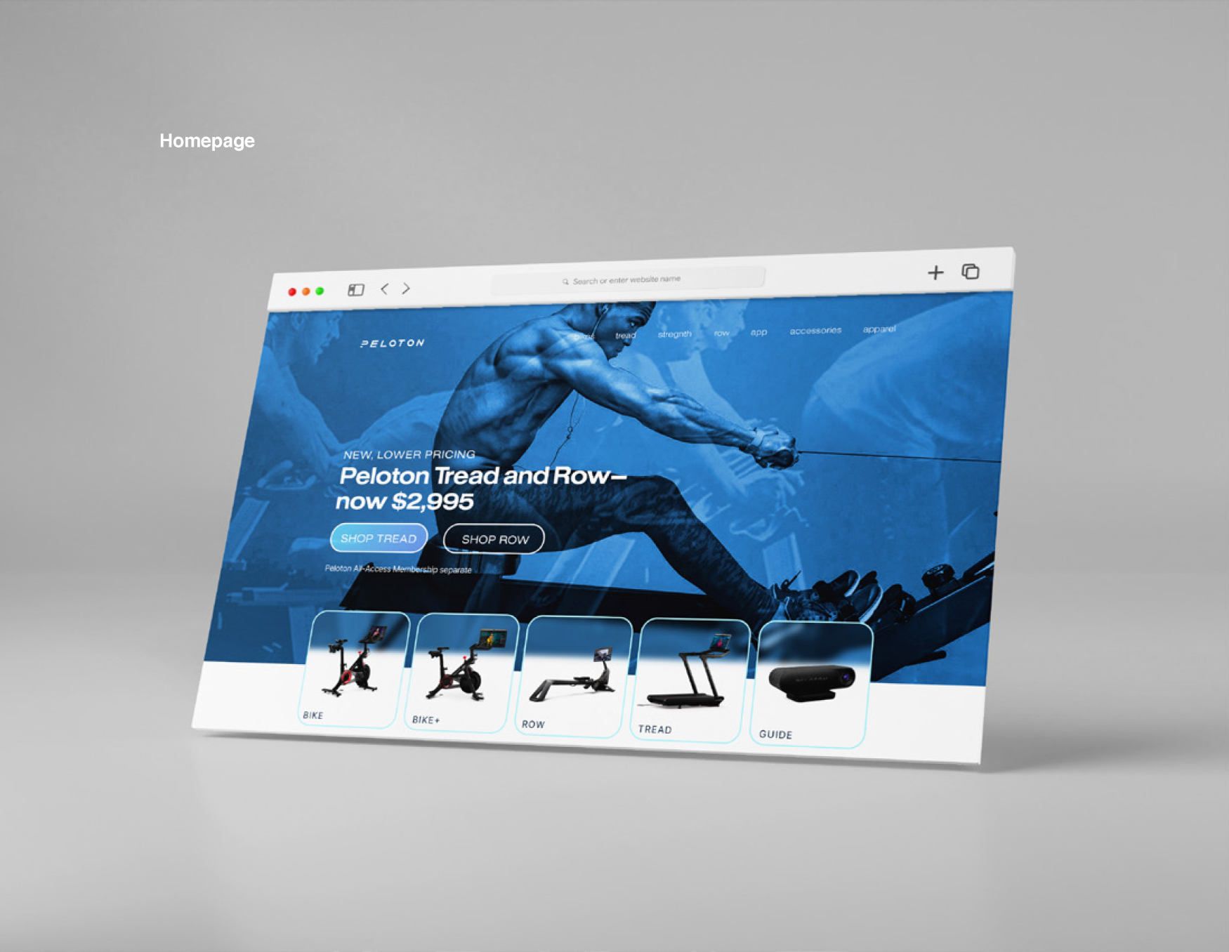
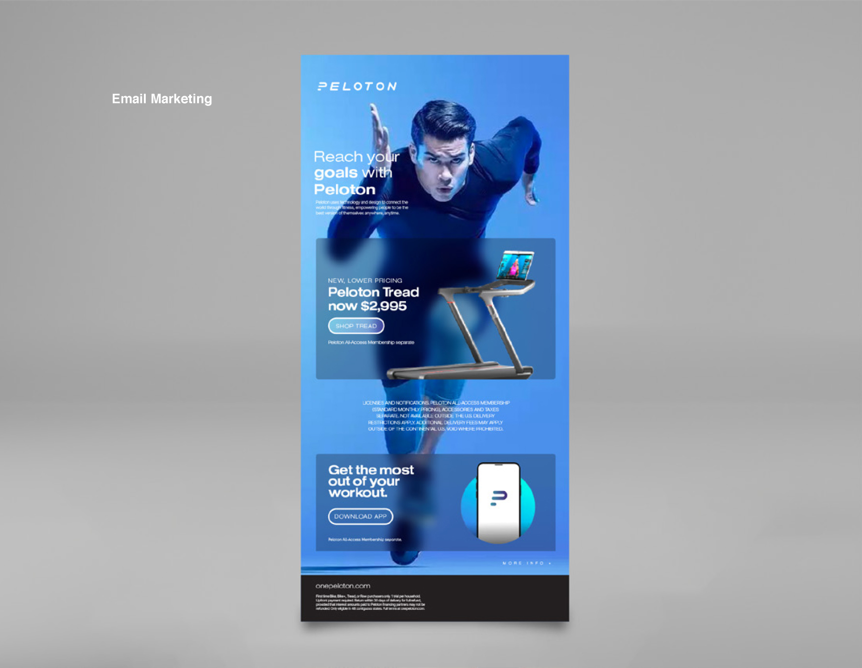
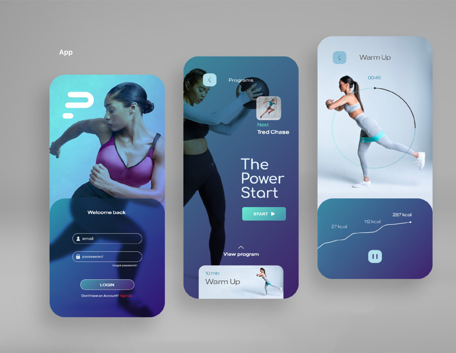
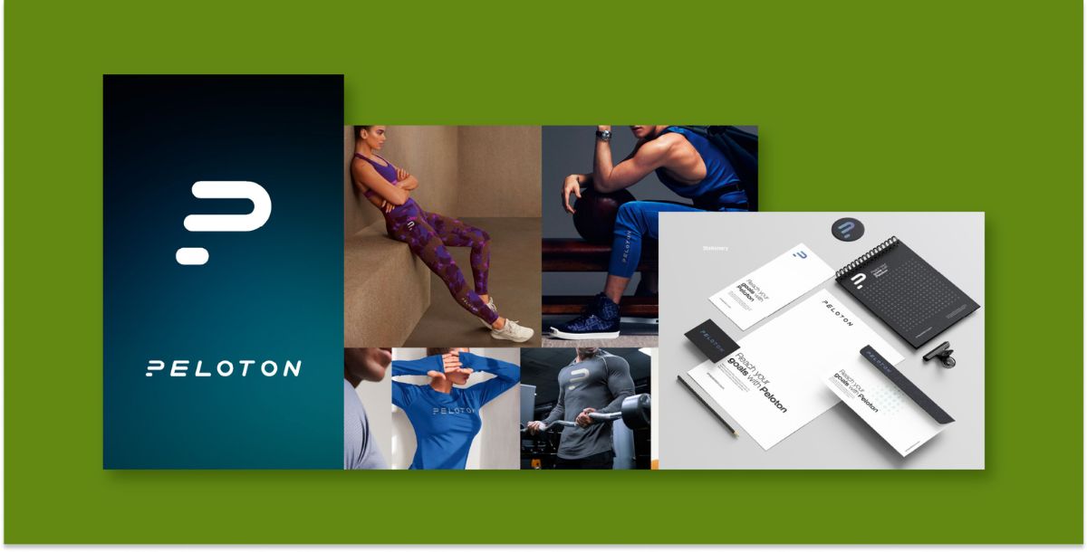
The new elements of the brand were brought to 2/3 life with notebooks, brochures, and apparel that made the new Peloton lifestyle tangible. The digital assets shared on social media and the website took on a new life, while the app was redesigned for the sleekest, user-friendly experience possible. Integrating email marketing into the media mix would allow Peloton to stay top-of-mind, nurture leads, and drive sales through personalized, targeted messaging and campaigns.
By leveraging data and testing, Peloton can optimize email content and strategy to increase open rates, click- throughs, and subscriber engagement over time. Through our expertise in evolving brands by starting with consumer insights & strategic positioning, we outlined a roadmap for Peloton to grow into the impactful wellness partner that it has the potential to be.
Creative
Logo & Icon
Photography Filters
Collateral
Website design & develoment
Environmental Graphics
Promotional Products
Social Media
Email Marketing
App UX / UI Design
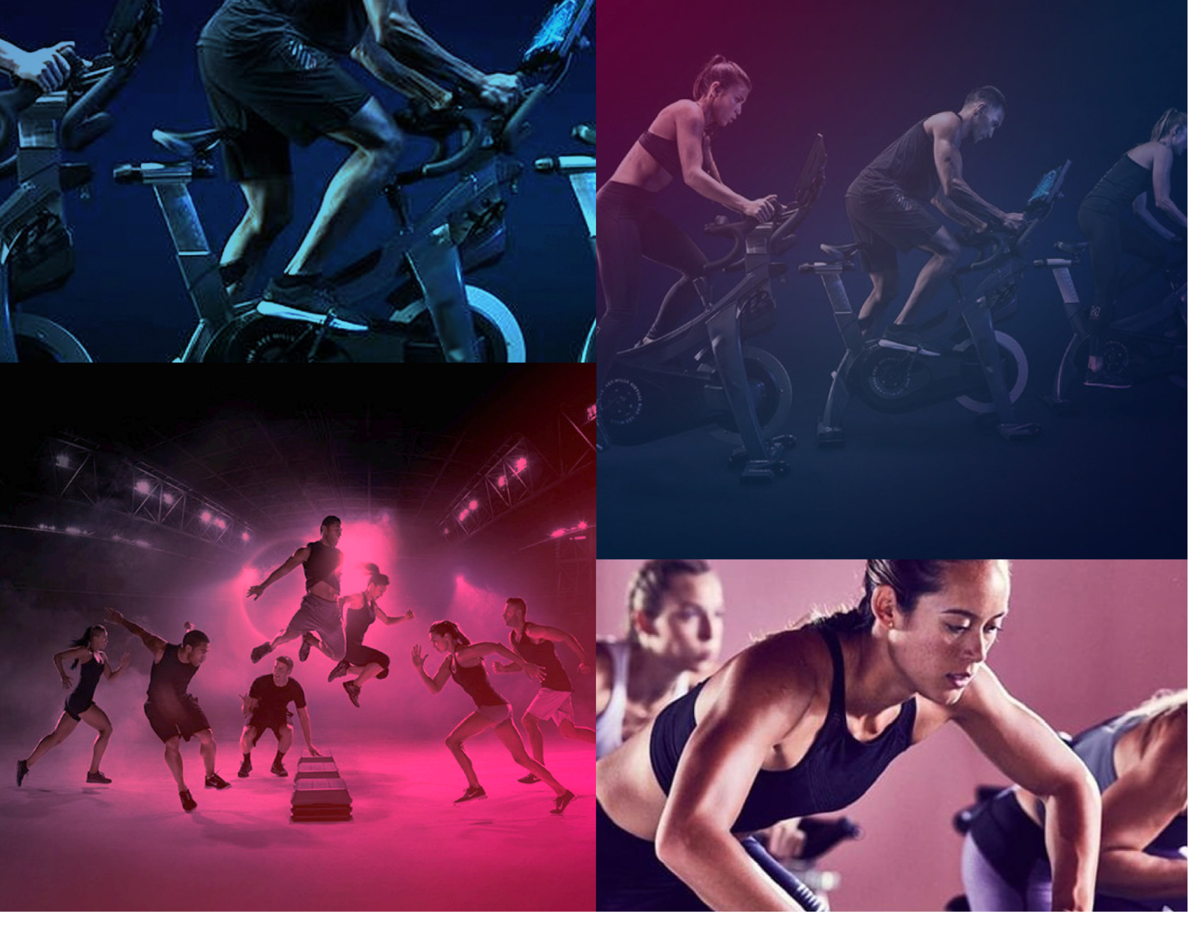
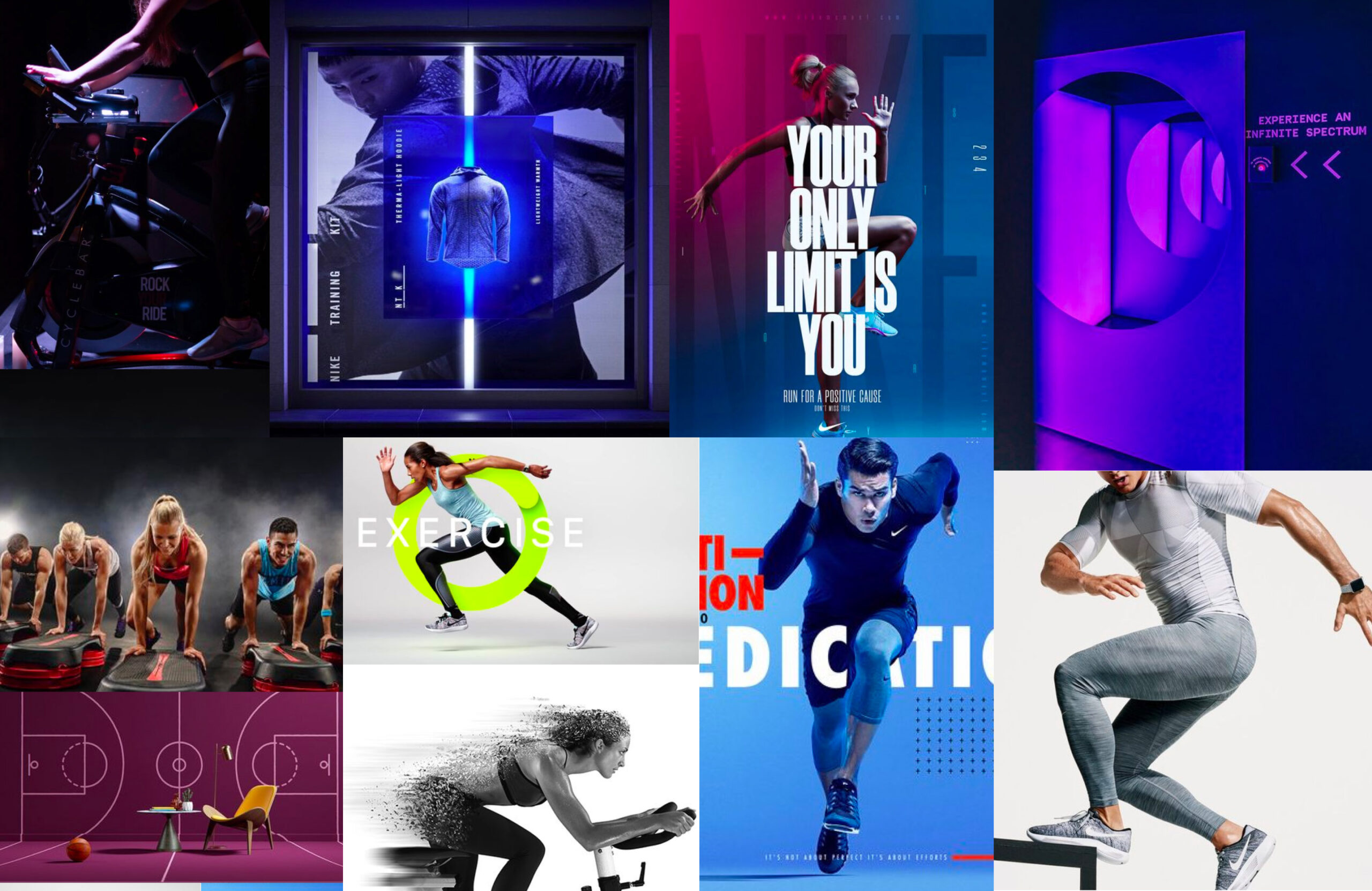
MOODBOARD
The Peloton moodboard embraced bold motion and futurism through dynamic shapes, active photography, and layered vibrant hues that evoked perpetual movement. Condensed, sleek typography and graphical metrics lent a digital, forward-thinking look. These kinetic visuals captured a spirit of innovation and accessibility to reimagine Peloton as an inclusive wellness brand.
LOGO DEVELOPMENT
The redesigned Peloton logo was inspired by the angle and motion of a runner leaning forward as they sprint, as well as the stance of someone leaning forward on a bike. The icon captures the feeling of momentum by depicting angled typography that appears to be surging forward. This kinetic wordmark aims to communicate perpetual energy and progress. The angled, condensed letterforms evoke a figure in motion, representing Peloton propelling its consumers ahead on their unique fitness journeys.
COLOR PALETTE
The new Peloton color palette embraces vibrant chromatic purples and teals that stand out from competitors. Layered together, the bold colors create visual excitement that aligns with Peloton’s inclusive, motivational rebrand. The mix of purple and teal hues reflects Peloton’s mission to energize diverse consumers’ wellness journeys.
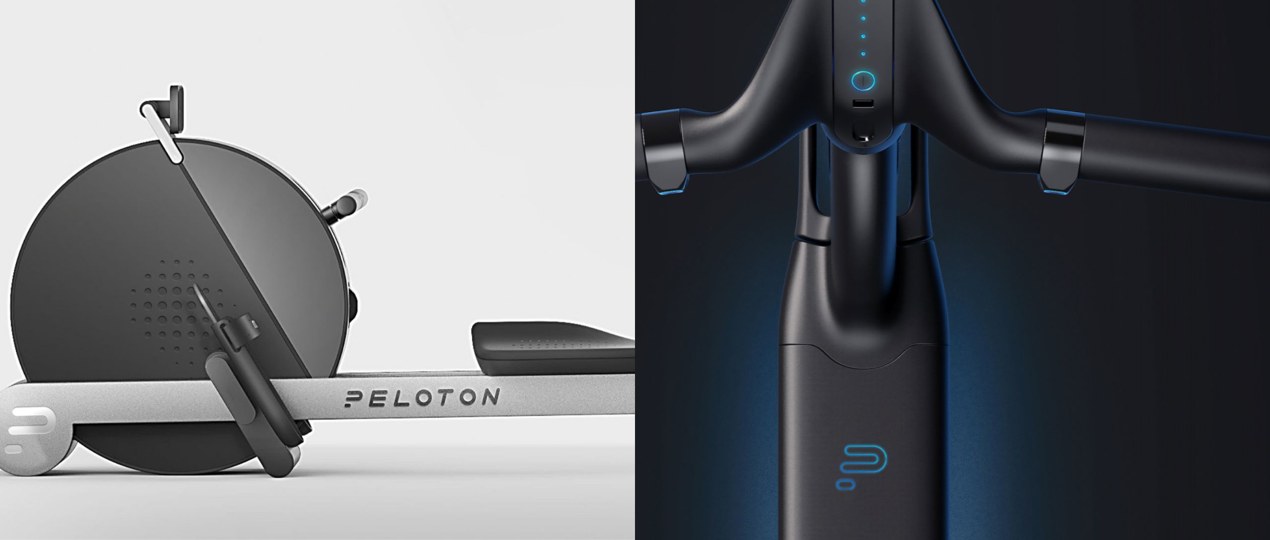
The redesigned equipment features a sleek, subtle chrome finish and futuristic lighting.
DIGITAL PRESENCE
Peloton’s refreshed vibrant logo, photography, and bold color palette created a cohesive, engaging identity across social platforms and the redesigned app.