True Connection Communities

Multifamily Real Estate

Services

Positioning 

Campaign Strategy 

Competitive Analysis 

Full-Service Brand Identity & Messaging 

Copywriting 

Custom Website Design & Development 

Engrain SightMap Software 

Property Photography & Videography

True Connection Communities, a private equity company managing 18 senior housing properties across the US, required an overhaul of their outdated brand identity and web presence. Through comprehensive research, strategic repositioning, and an integrated rebrand spanning brand identity, web design, production, collateral and more, Uncomn successfully transformed True Connection 

Communities dated aesthetic into a vibrant, engaging brand focused on resident enrichment. The lively new logo, patterns, imagery and messaging authentically aligned with True Connection’s mission to inspire community, nurture happiness, and provide exceptional living experiences. Uncomn’s tailored solutions enabled True Connection Communities to evolve from a stagnant brand into a modern, energetic leader in senior living nationwide. Their revitalized identity resonates with today’s active retirees seeking fulfilling lifestyles. Overall, this multifaceted rebrand exemplified Uncomn’s ability to completely reinvigorate brands through data-driven insights and bold, innovative creative strategy.

CHALLENGE

With an outdated brand identity failing to generate energy and excitement, True Connection Communities needed a complete rebrand to reinvigorate their image. Their stale logo, muted color palette, and bland photography felt disconnected from the vibrant amenities and activities offered. Content and messaging lacked relevance to modern retirees’ interests and vibrant lifestyles. The existing identity failed to resonate with residents, families, and even employees who took pride in True Connection’s offerings. With competition emphasizing luxury living, True Connection Communities required bold, lively creative direction to highlight their focus on community engagement, dining, fitness, learning and fun. The client aimed to inspire smiles with a refreshed brand that residents would be thrilled to call home. Uncomn needed to inject energy to evolve True Connection Communities from a relic brand into a modern, vibrant leader at the forefront of senior living.

INSIGHTS

Our discovery process uncovered True Connection Communities’ core brand values centered on enriching residents’ lives, from energizing the spirit to unleashing the imagination. These insights shaped True Connection Communities’ refreshed positioning and messaging around being the premier choice for active adult living with exceptional dining and programs. Their mission was to inspire residents to discover freedom, connections, adventures and a new lifestyle. At the core, True Connection Communities aimed to create memorable experiences because resident happiness drives their success. 

This strategic foundation guided True Connection Communities’ brand development. Competitive analysis revealed gaps in showcasing their lifestyle offerings to highlight differentiation. We identified opportunities to emphasize the amenities, activities, dining and community to attract modern retirees seeking fulfillment. The new brand needed to convey energy and engagement across all touchpoints. Overall, our insights showed True Connection Communities could promote resident enrichment through reimagining their identity centered on resident happiness.

SOLUTION

The cornerstone of the rebrand was a dramatically refreshed logo and visual identity system. The new logo combined iconography of connected individuals with rounded, approachable typography. This bold new mark encapsulated the engaging True Connection lifestyle and was a stark departure from the former dated logo. An expanded color palette of bright blue, green, pink and yellow hues created an energetic, friendly aesthetic that was also ADA compliant. Playful patterns incorporating the signature icon visually reinforced the sense of belonging and connection between residents that was central to True Connection’s community focus. Together, the new logo, icon, patterns, and colors formed a cohesive and approachable visual identity that aligned beautifully with True Connection Communities’ mission. 

The new vibrant brand identity was brought to life through a custom-designed website optimized to convey True Connection’s enriching community and lifestyle.

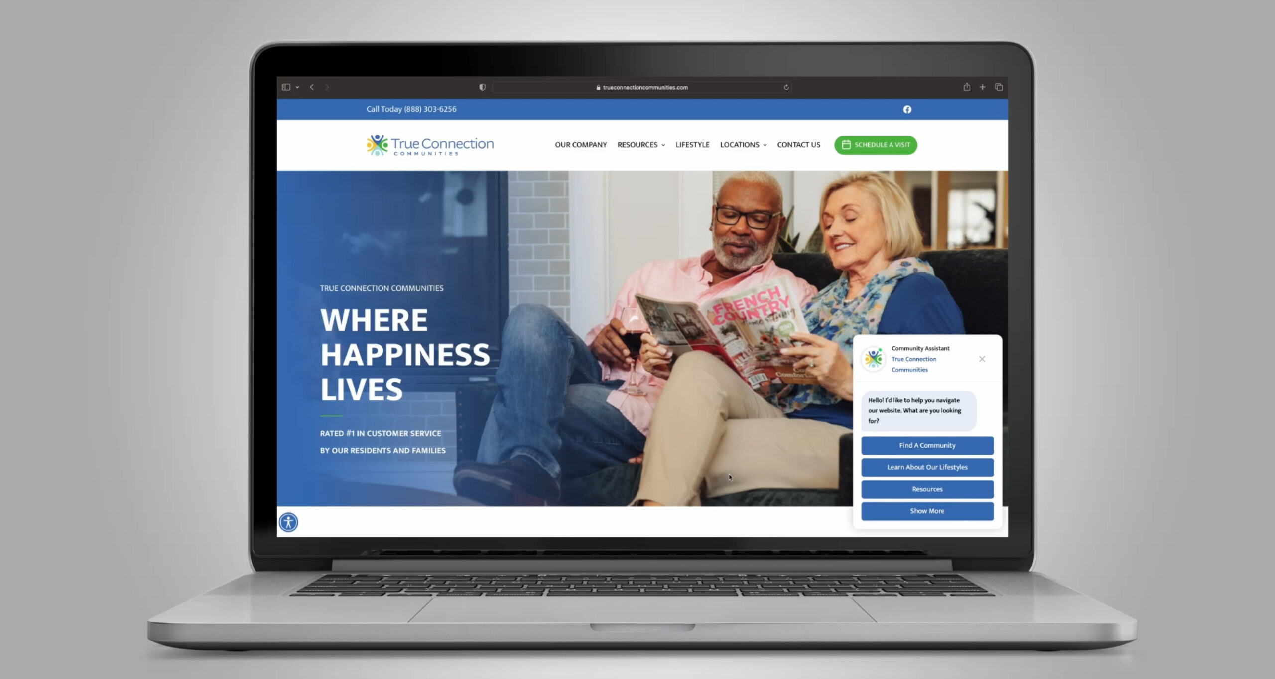
Vivid imagery and intuitive navigation enabled prospects to easily explore offerings at each location. The robust sitemap empowered visitors to narrow options by amenities, home types, availability and more. Conversion-focused features like interactive sitemap, floor plans and real-time inventory integrated with the property management software enhanced leasing potential. Thoughtful web copy tailored to the senior demographic spoke to the engaging True Connection Communities experience and technically optimized pages enhanced SEO strength. Overall the new website played a pivotal role in showcasing the reimagined brand. 

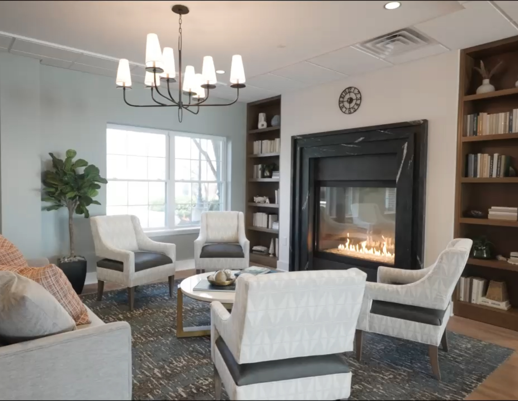
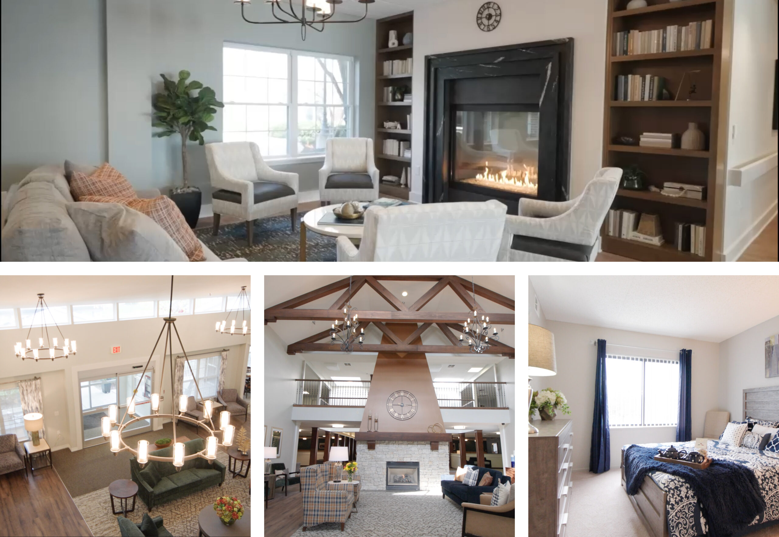
To authentically convey True Connection Communities’ lifestyle, Uncomn orchestrated extensive photo and video production. Property photography and videography enabled each location’s amenities and architecture to shine. Detailed shot lists ensured capturing well-appointed residences as well as community spaces. Lifestyle photography incorporated models interacting across common areas to bring the communities to life. Uncomn managed the full creative process from shoot production to photo editing and video post-production. The compelling imagery and videos featured throughout the website, digital advertising, collateral, and social media played an integral role in showcasing the True Connection Communities experience. 

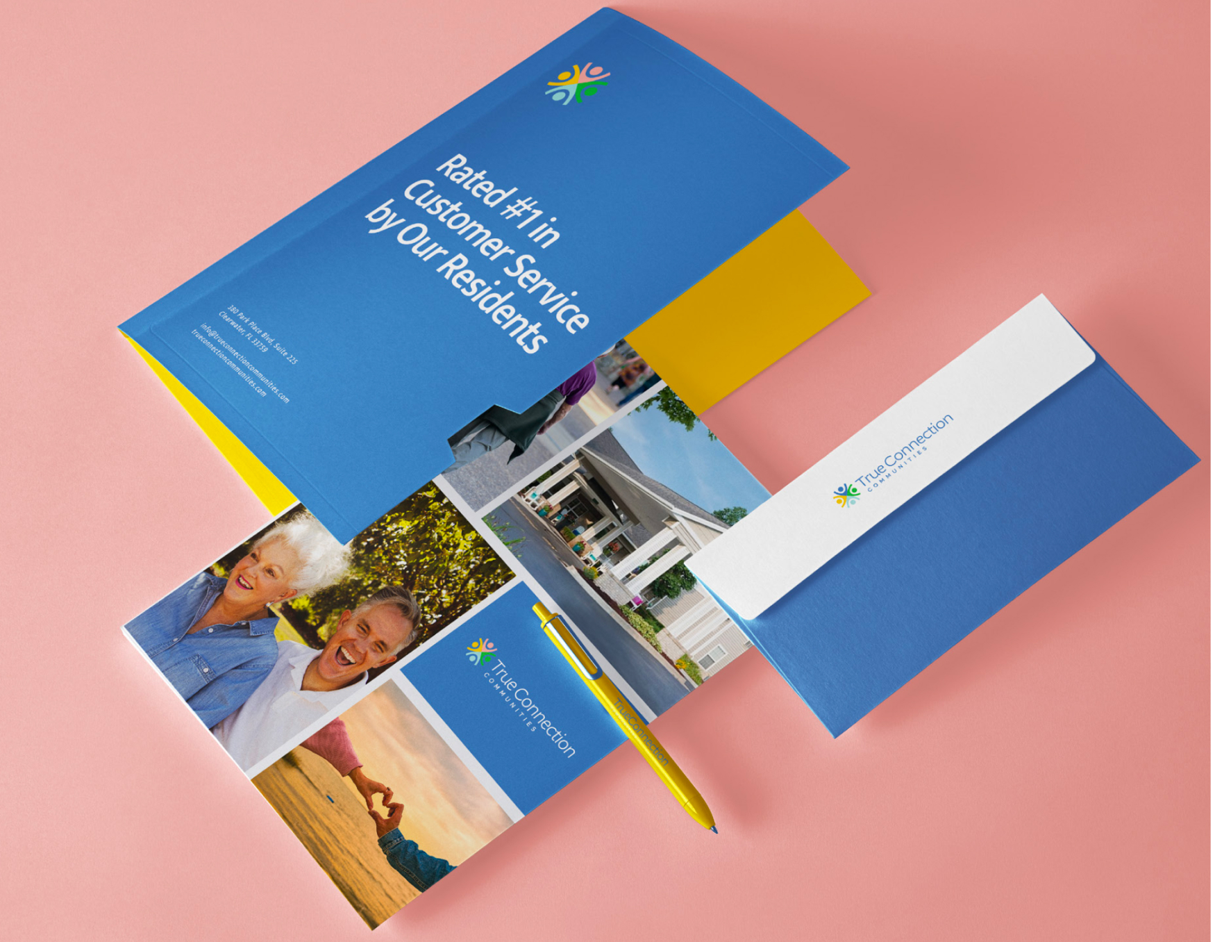
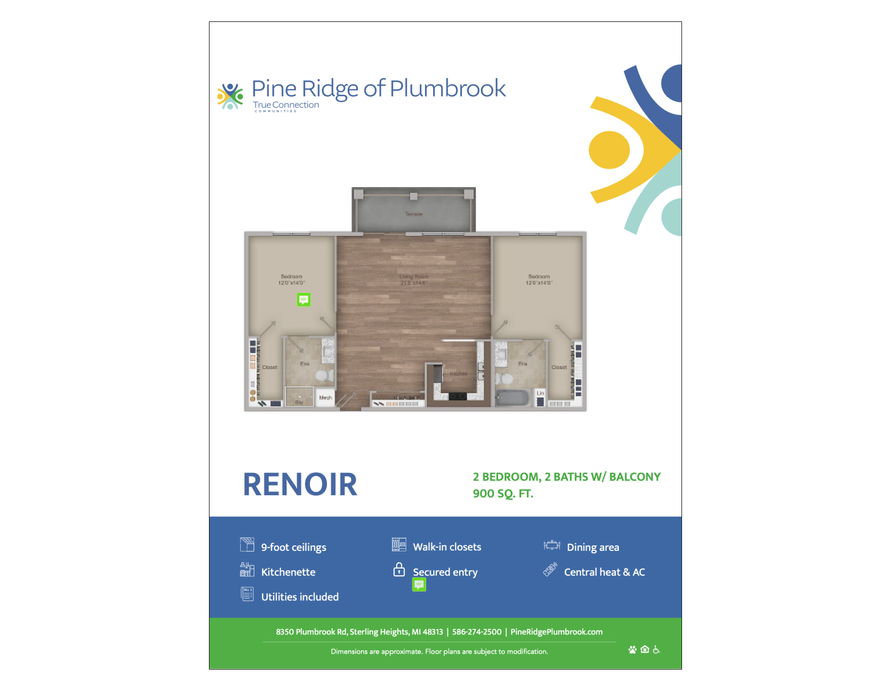
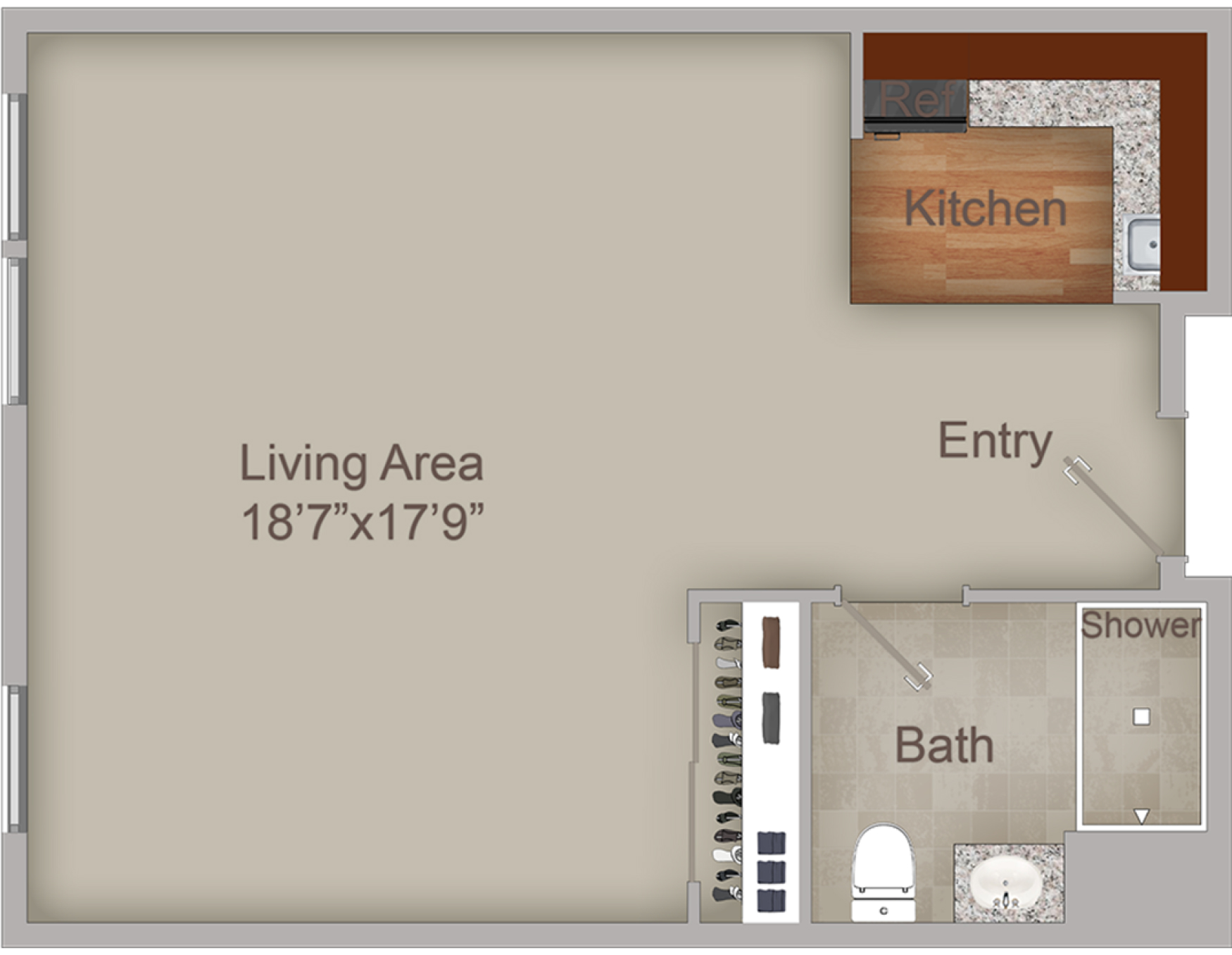
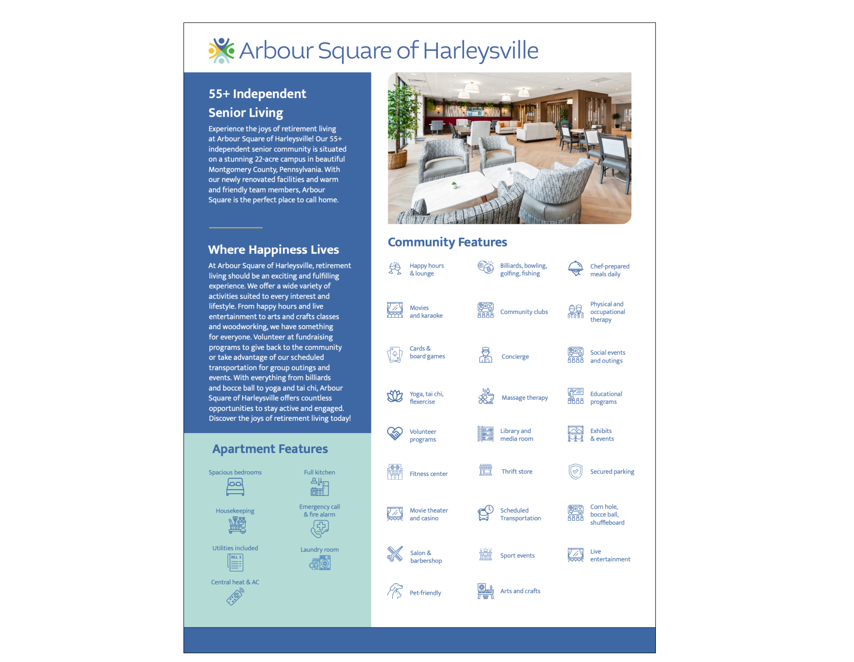
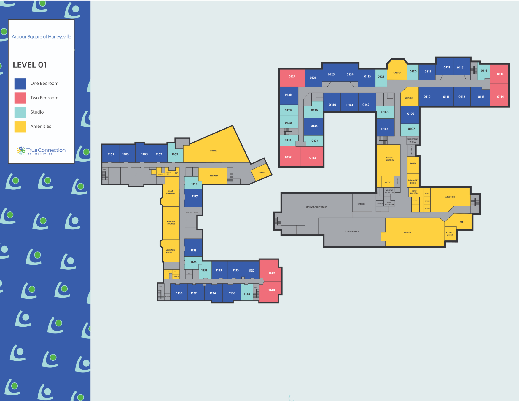
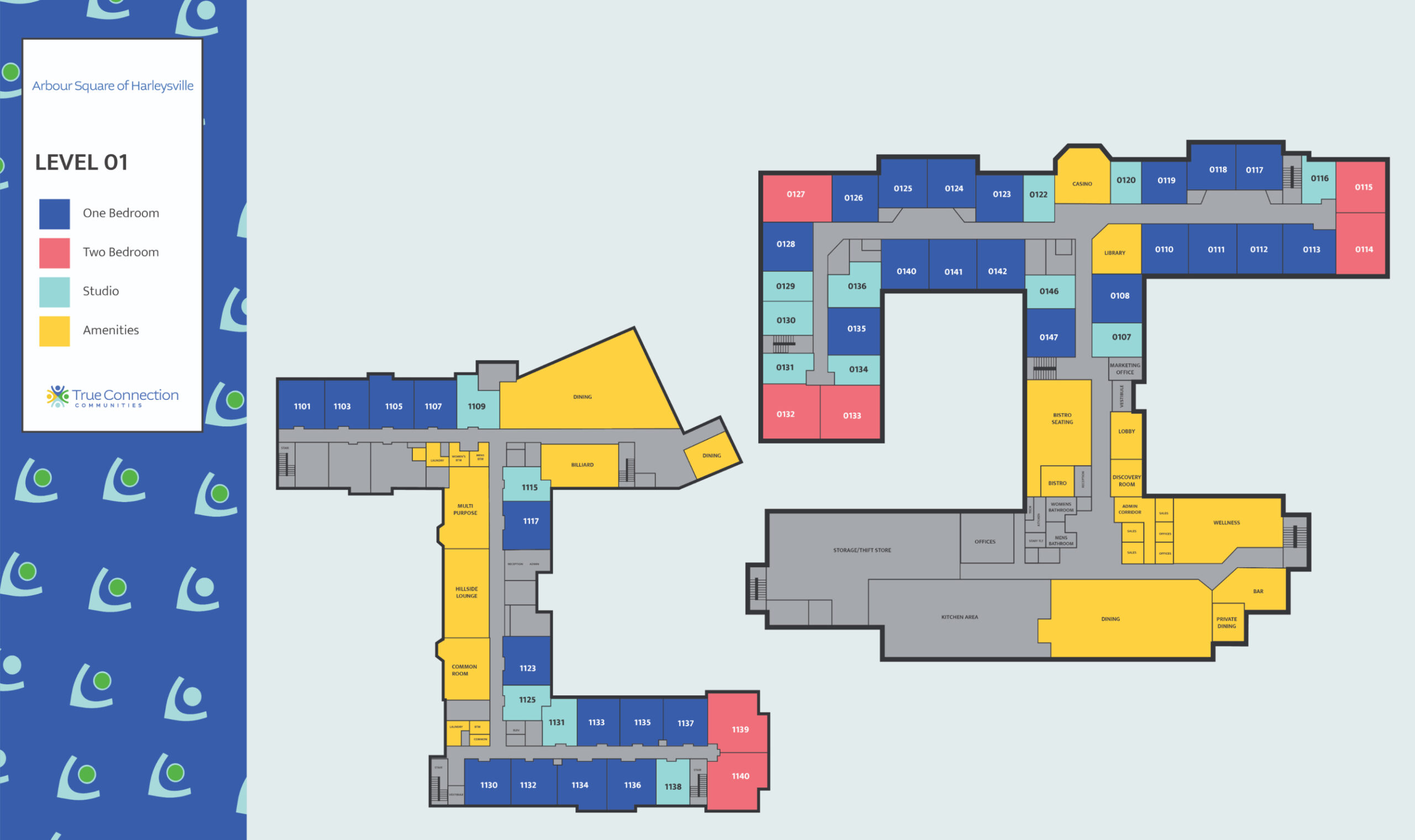
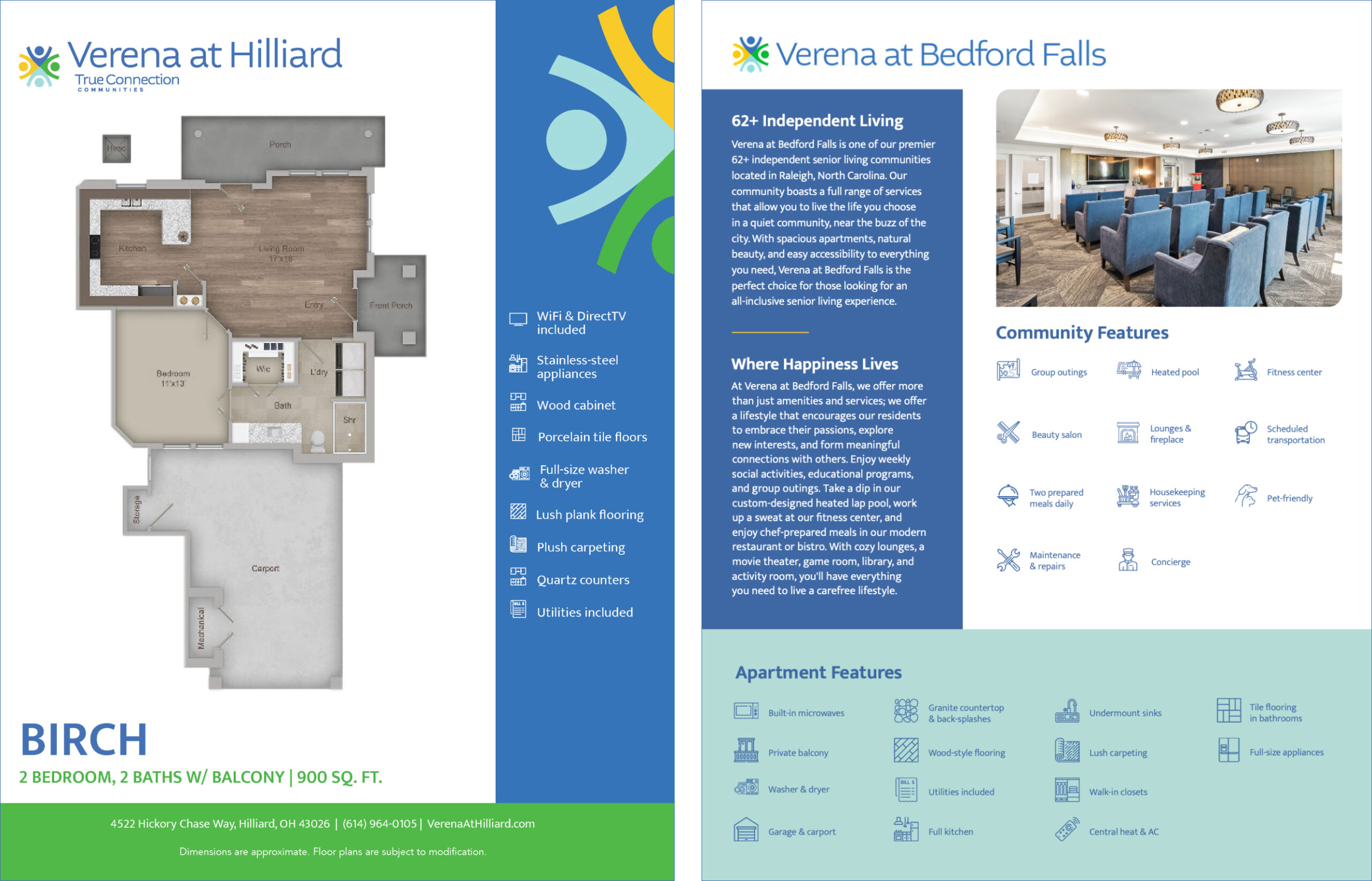
Uncomn designed a suite of bold yet refined branded collateral to extend the new True Connection Communities’ identity across all touchpoints. This included a stationery package encompassing letterhead, envelopes, and business cards featuring the vibrant colors and patterns. An engaging brochure showcased the reimagined brand through dynamic lifestyle photography and easy-to-digest content. Sell sheets provided concise overviews tailored to each property’s specific offerings. Custom 2D floor plan illustrations communicated home layouts and amenities. Innovative sitemaps oriented prospects and enabled easy navigation of the extensive on-site features. Each piece played a valuable role in conveying the new friendly, welcoming essence of True Connection Communities. The cohesive collateral materials made the brand vision tangible for prospects while assisting sales and marketing efforts. 

To extend True Connection Communities’ brand visibility online, Uncomn implemented an ongoing blog and search optimization strategy. Topical, lifestyle-focused blog posts provided value for prospects while optimizing the website for informational keywords. Blogs covered relevant senior living topics from nutrition to community involvement, establishing True Connection Communities as a thought leader. Articles incorporated target keywords to improve visibility in search for terms like “senior fitness” and “retirement hobbies.” Headlines were optimized to drive clicks from search engines. Alt text, metadata and internal linking further enhanced SEO strength. The consulting team advised on technical website optimizations to improve speed and mobile user experience. Together these efforts expanded True Connection Communities organic reach, drove more qualified traffic to the website and strengthened their authority in senior living. 

Through comprehensive research, strategic repositioning, and an integrated rebrand spanning brand identity, web design, production, collateral and more, Uncomn successfully transformed True Connection Communities dated aesthetic into a vibrant, engaging brand focused on resident enrichment. The lively new logo, patterns, imagery and messaging authentically aligned with True Connection’s mission to inspire community, nurture happiness, and provide exceptional living experiences. Uncomn’s tailored solutions enabled True Connection Communities to evolve from a stagnant brand into a modern, energetic leader in senior living nationwide. Their revitalized identity resonates with today’s active retirees seeking fulfilling lifestyles. Overall, this multifaceted rebrand exemplified Uncomn’s ability to completely reinvigorate brands through data-driven insights and bold, innovative creative strategy. 

Creative

Logo Development
Custom Icon & Pattern
Color Palette Curation
Custom Website
Stationery Package
Brochure
Floor Plan Inserts
2D Floor Plan Design
Sell Sheets
Lifestyle photoshoot w/ models
Property Photoshoot
Full Building Property Video
Interactive Sitemap
Logo Development
Custom Icon & Pattern
Color Palette Curation
Custom Website
Stationery Package
Brochure
Floor Plan Inserts
2D Floor Plan Design
Sell Sheets
Lifestyle photoshoot w/ models
Property Photoshoot
Full Building Property Video
Interactive Sitemap
True Connection Communities Case Study 1

Inviting, ADA-Compliant
Brand Identity

Uncomn created an energetic yet refined brand identity for True Connection Communities to highlight their lively offerings. The new logo combined friendly iconography and bold typography in an ADA-compliant palette of vibrant hues. Playful patterns brought visual warmth while custom icons reinforced connections between residents. Thoughtful design considerations made the identity system accessible and easy to interpret across print and digital. Uncomn built an engaging aesthetic aligned with the True Connection Communities mission through inclusive elements that made prospects smile.

True Connection Communities Case Study - Logo
True Connection Communities Case Study Tagline
True Connection Communities Case Study Color Palette
True Connection Communities Case Study- Icons

Streamlined Assets Across Portfolio

True Connection Communities’ national footprint of 18 communities required a strategic approach to branded asset development. Uncomn formulated creative templates and guidelines to maintain cohesion across diverse markets. Custom illustrations like sitemaps efficiently incorporated property-specific details while remaining on-brand. Diligent oversight and management of asset creation, from 2D floor plans to print materials, ensured consistent identity execution portfolio-wide while allowing customization that made prospects feel special.

True Connection Communities Sightmap Design
True Connection Communities Property Logos
True Connection Communities Case Study
Lifestyle Photography
True Connection Communities Brochure
True Connection Communities Floor Plan Inserts
True Connection Communities Custom Website
True Connection Communities Case Study 1