In the heart of North Hollywood’s Arts District, where creativity meets urban living, Camden Securities Company envisioned L+O as a groundbreaking 297-unit luxury development. The project required more than just marketing apartments—it needed a comprehensive brand strategy that would establish L+O as the premier destination for those seeking both connection and tranquility in LA’s most dynamic arts neighborhood.
CHALLENGE
As North Hollywood underwent rapid transformation, L+O faced a critical challenge: how to stand out in an increasingly competitive luxury housing market while attracting residents who valued both artistic energy and wellness-focused living. The property needed to command premium rents, justify its positioning, and create an emotional connection with potential residents—all before construction was complete. Additionally, the project needed to bridge the gap between the area’s artistic heritage and its evolution into a luxury living destination.
INSIGHTS
Our research revealed a compelling opportunity in the changing demographics of North Hollywood. The neighborhood had become a magnet for a diverse mix of creative professionals, entertainment industry talent, and young urbanites seeking an authentic arts district experience. These residents valued:
Cultural proximity to the NoHo Arts District
Wellness-focused amenities and lifestyle programming
Contemporary design with sophisticated aesthetics
Community spaces that fostered both creativity and tranquility
Relative affordability compared to Downtown or West Hollywood
Most importantly, we identified a crucial insight: these residents weren’t just looking for an apartment—they were seeking a sanctuary that could inspire creativity while providing retreat from urban intensity.
SOLUTION
Our research revealed a compelling opportunity: North Hollywood’s unique blend of longtime residents, creative professionals, and entertainment industry talent created perfect conditions for a community focused on holistic living. We identified our core demographic as ambitious singles and young professionals in their late 20s to early 40s, attracted by the area’s relative affordability compared to Downtown or West Hollywood.
Creative
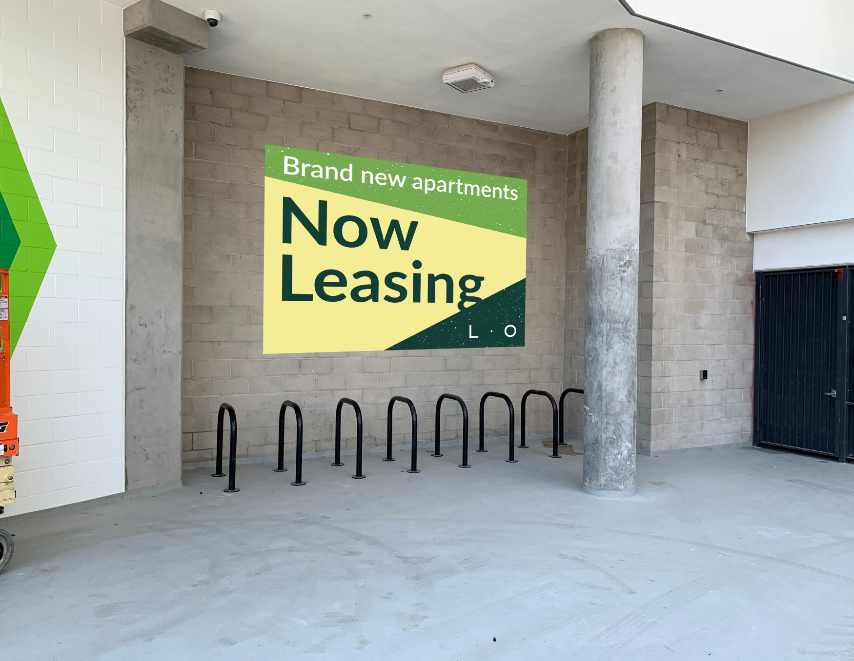
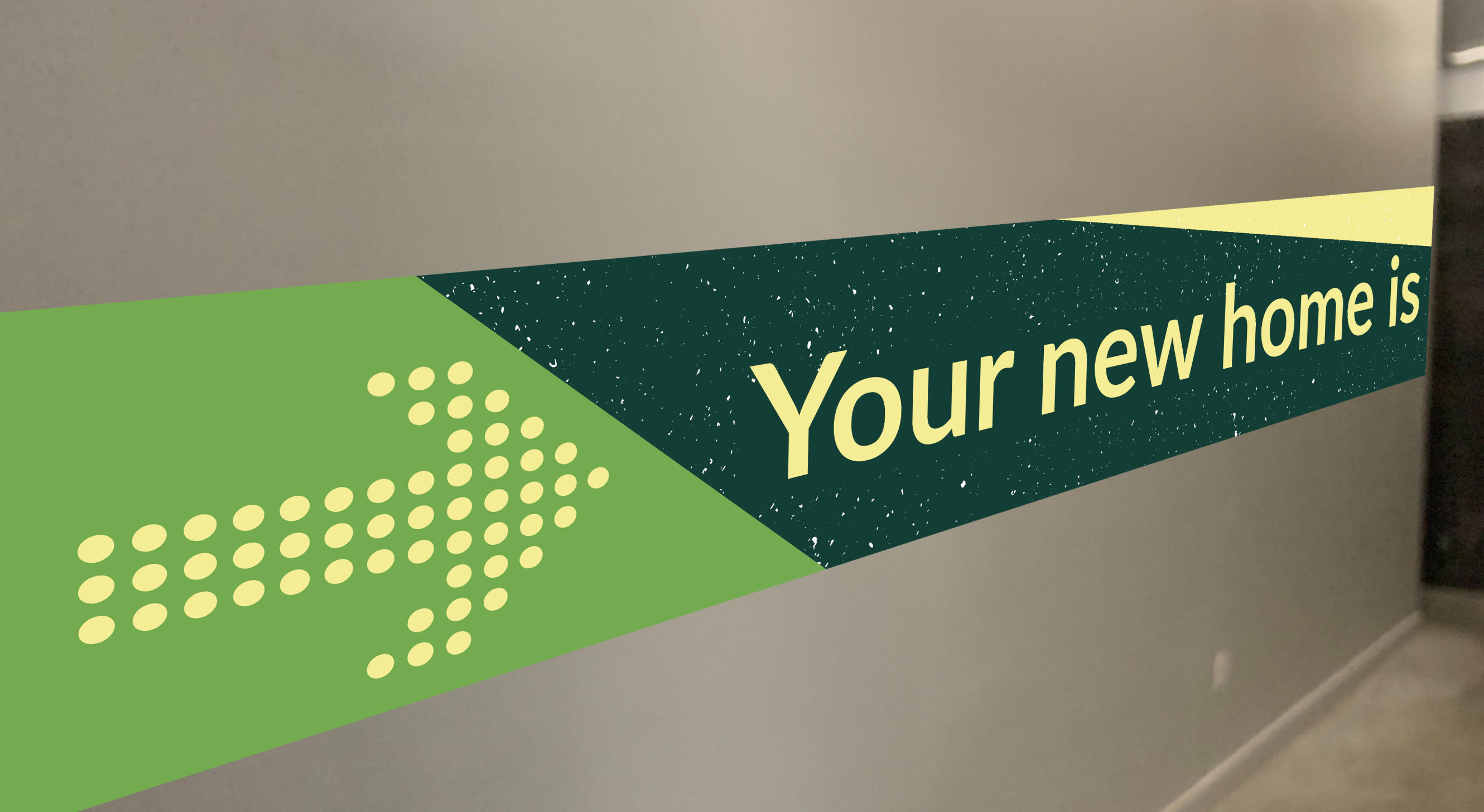
Leasing Signage
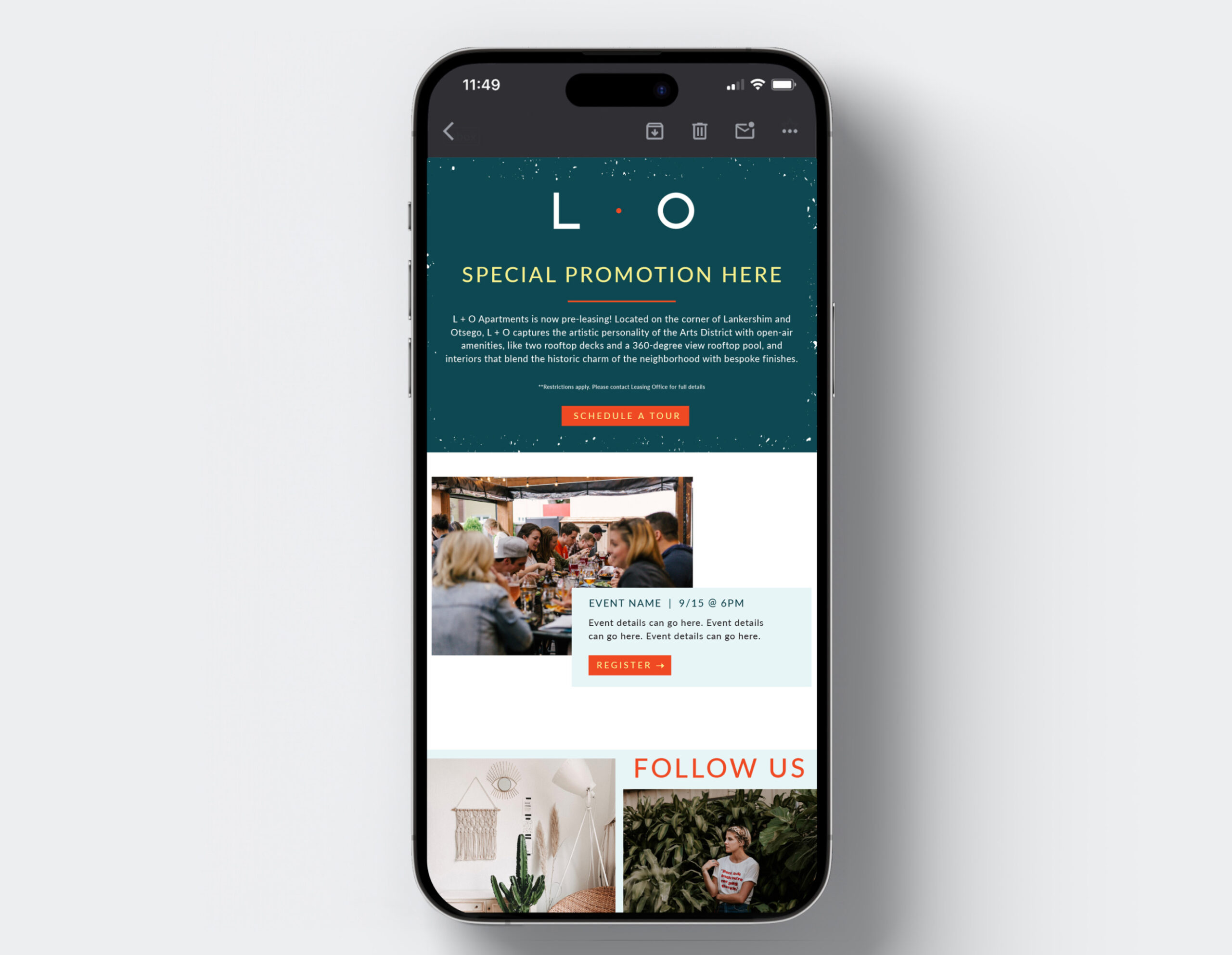
Email Template
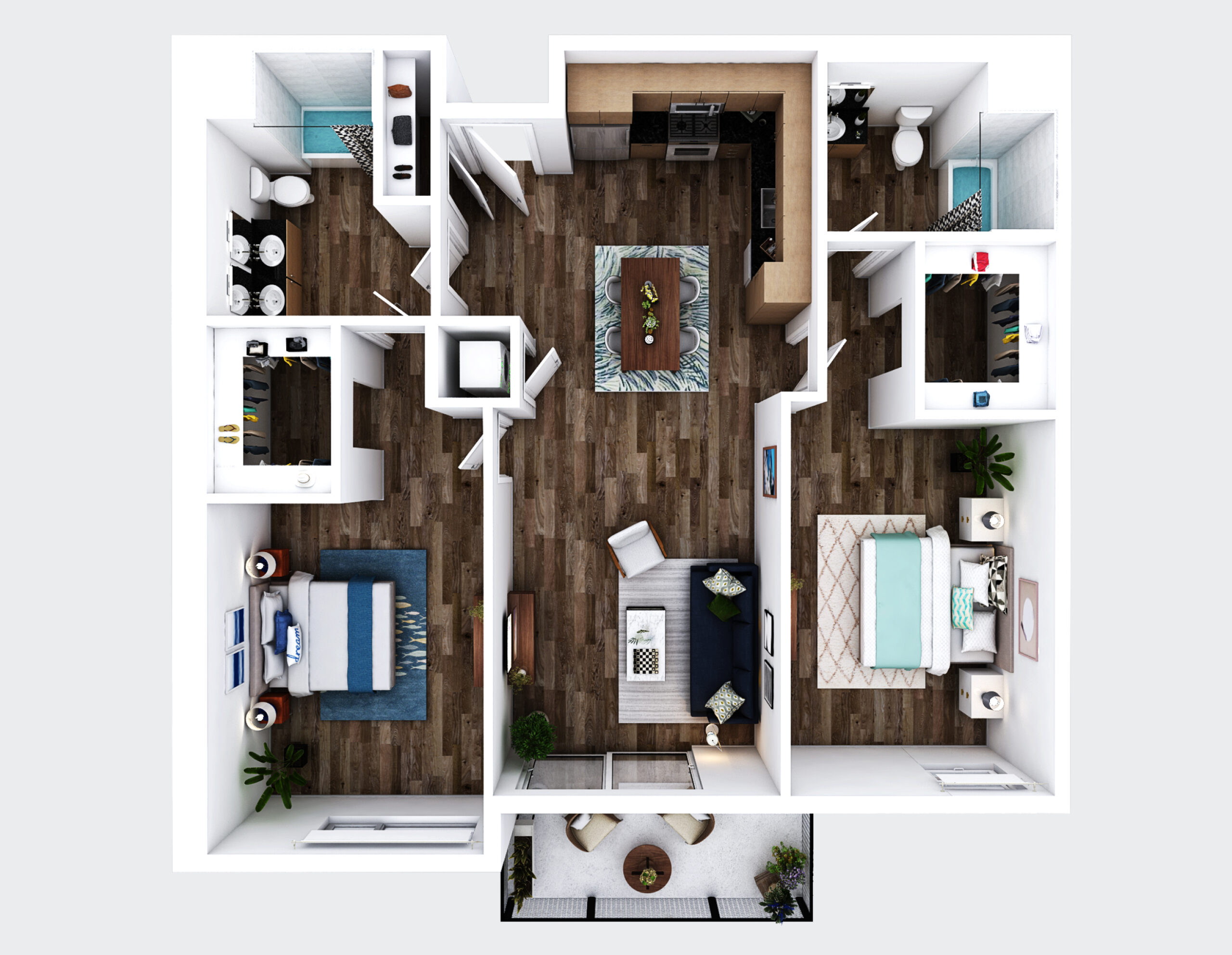
3D Floor Plans
Photography
Brand Identity
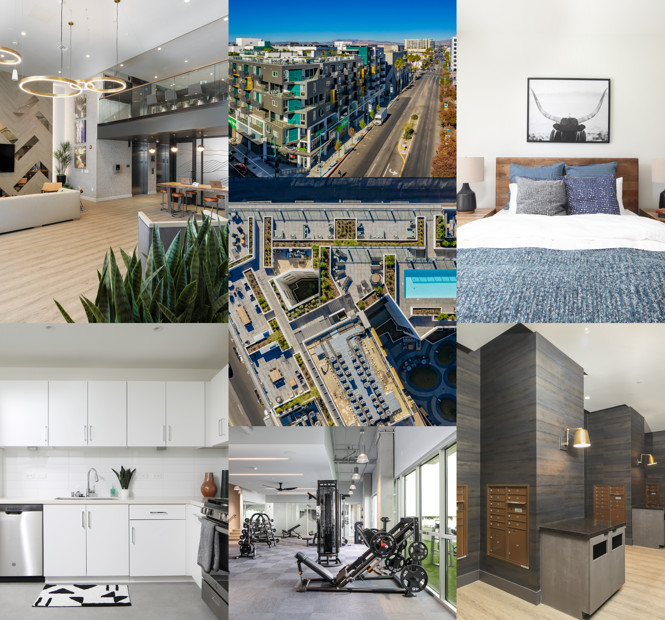
The visual identity we created reflects the duality of L+O’s appeal. Clean, contemporary typography pairs with an earthy, sophisticated color palette dominated by deep teals and vibrant accent colors. Custom patterns and textures add depth while referencing architectural elements of the property. The photography style captures both the energy of community spaces and the serenity of private retreats.
Website Design
Developed a 7-page custom website that delivered an immersive preview of the L+O lifestyle, featuring interactive floor plans, neighborhood guides, and high-impact imagery that showcased both the property’s dramatic architecture and intimate community spaces.
Signage Production
Distinctive exterior signage – Wayfinding systems – Environmental graphics Marketing center displays – Community space branding
Photography & Videography
Visual Storytelling: In a market where digital first impressions drive leasing decisions, exceptional photography became a cornerstone of L+O’s success story. Our comprehensive photo strategy captured three key narratives: Architectural Excellence: We showcased L+O’s distinctive design through dramatic twilight exteriors and architectural detail shots that highlight the building’s bold geometric forms and premium finishes. Aerial photography of the rooftop pool deck and community spaces revealed the property’s impressive scale while emphasizing its resort-style amenities.
Lifestyle Integration: Interior photography focused on the seamless flow between private and social spaces, capturing both serene living environments and vibrant community areas. The images reflect the property’s wellness-focused positioning through careful attention to natural light, greenery, and thoughtfully designed gathering spaces.
Neighborhood Connection: Street-level photography placed L+O firmly within the context of the NoHo Arts District, highlighting the ground-floor retail integration and easy access to neighborhood amenities. These images tell the story of an connected urban lifestyle while emphasizing the property’s role as a peaceful retreat.