
Multifamily Color Forecast 2025


The Palette of Tomorrow
At Uncomn, we’re devoted to future-proofing brands by tapping into the cultural currents steering industries forward. For multifamily real estate, a captivating color palette is essential to crafting communities that feel fresh yet built to last. Join us on an imaginative journey as we reveal the 5 key colors that will bring your multifamily properties to life, resonate deeply with residents, and distinguish your brand from competitors. Our design fortune-tellers have immersed themselves in cultural insights to unlock a palette brimming with vibrant energy and timeless allure.
- Cosmic Twilight – A mood-enhancing deep blue that radiates mystery. Its versatility enables powerful branding and interiors.
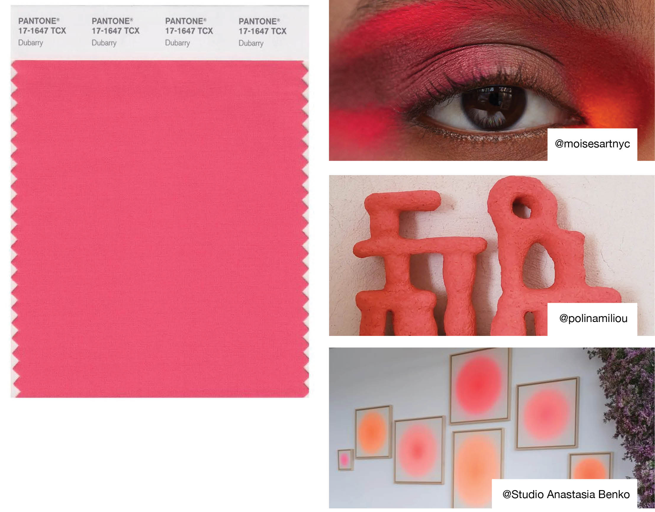
- Staycation Zest – An energizing coral bursting with celebratory spirit. It delivers joyful pops of color.
- Matcha Latte – An earthy green that promotes tranquility and wellness. It connects people to nature.
- Rustique – A natural peach shade bringing warmth through organic materials and simplicity. It conveys responsible luxury.
- Chromatic Escape – A radiant, electric blue that evokes a sense of wonder and delight. It injects spaces with vibrant energy.
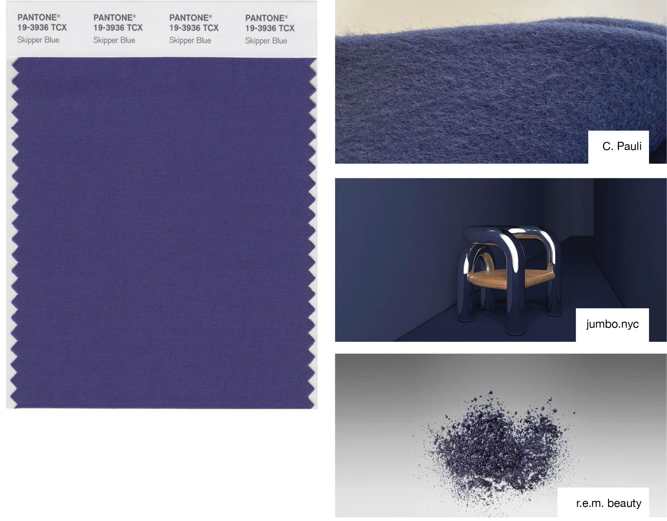
Cosmic Twilight
Pantone: 19-3936 TCX
With mood-enhancing mysticism, Cosmic Twilight brings versatile power to branding and interiors. Blending blue and purple undertones, it exudes imagination and the allure of the unknown. Cosmic Twilight enables you to create showstopping, immersive environments that spark awe in residents. Lean into its sense of escapism as a compelling alternative to one-dimensional navies and blacks. Let this multi-dimensional hue infuse your properties with depth and personality that resonates for years to come.
- Embrace as your signature color across diverse applications like logos, leasing signage, websites, and accent walls. Its depth enhances any design.
- Lean into its mystical allure with matte and shimmering finishes to amplify intrigue across surfaces.
- Use as a compelling alternative to navy or black for deeper vibes with added nuance.
Staycation Zest
Pantone: 17-1647 TCX
This vibrant coral radiates familiar summer vibes with a twist of novelty. Balancing cheerful undertones of red, orange, and pink, Staycation Zest conjures sunsets, sweet treats, and celebrations. The hue launches residents on a journey of playful nostalgia and feel-good futurism. Staycation Zest captures the pursuit of joy and infuses your properties with its vibrant energy.
- Add playful splashes to amenities like the pool area, fitness studio, and lobby to create an upbeat atmosphere.
- Incorporate in vacation-inspired model units to evoke familiar comfort with a twist of novelty.
- Pair with softer neutrals to inject spaces with youthful energy that maintains timeless appeal.
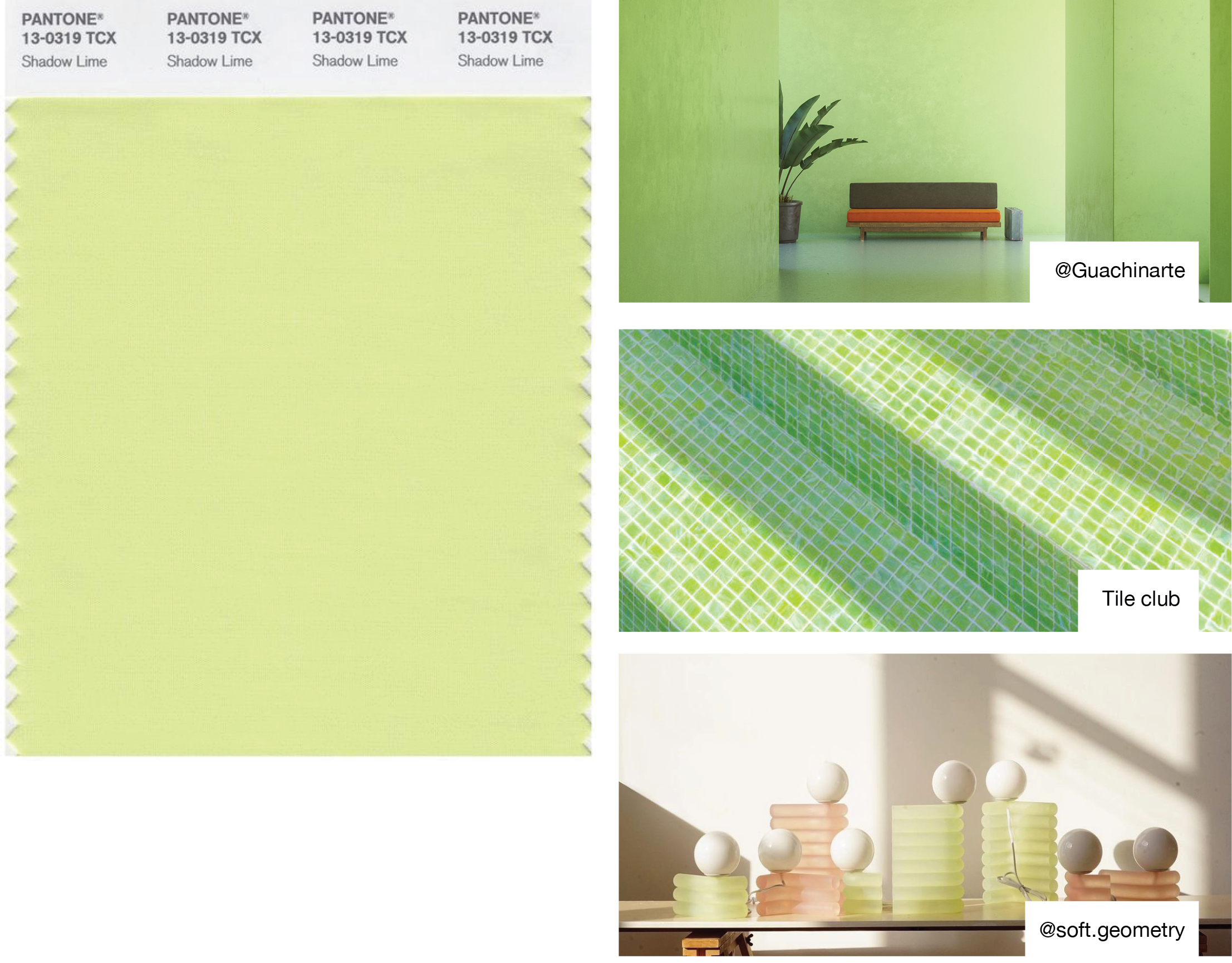
Matcha Latte
Pantone: 13-0319 TCX
Nature never goes out of style. This soothing pastel draws inspiration from the earth and future tech to infuse calm. Balancing natural hues with digital tranquility, Matcha Latte promotes rest, reflection, and rejuvenation. It celebrates the importance of renewable materials and crafts an ambiance of serenity. This grounded green exudes mindfulness and well-being when applied thoughtfully across your properties. Let Matcha Latte create a sanctuary from busy lifestyles and nurture residents in body, mind, and spirit.
- Apply to curated relaxation zones like yoga studios, lounges, and work-from-home offices to cultivate serenity.
- Complement with other cool tones to craft a relaxing retreat from busy lifestyles.
- Use organic textures like wool, linen, and wood to reinforce its earthy origins.
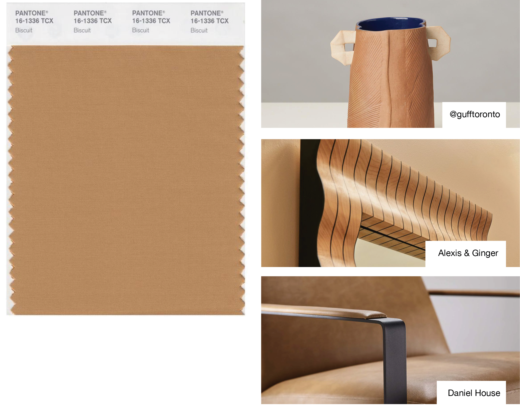
Rustique
Pantone: 16-1336 TCX
This grounded shade champions renewable materials and simplicity with its organic ambiance. Moving away from cold greys, Rustique brings the warming glow of sunlight to interiors through renewable woods, textiles, and leathers. It resembles natural fabrics and fibers, connecting residents to the slower rhythms of our planet. Rustique signifies embracing responsible luxury that promotes longevity across seasons. Let this trans-seasonal shade create an oasis of renewable style and comfort. Its subtle organic richness conveys permanence and flexibility across diverse applications. Rustique naturally grounds your brand in an eco-conscious future focused on people and the planet.
- Spotlight untreated woods, leathers, and textiles to exude organic yet refined style.
- Incorporate across seasons as a natural neutral with versatility for diverse applications.
- Pair with other muted earth tones to allow its subtle richness to shine.
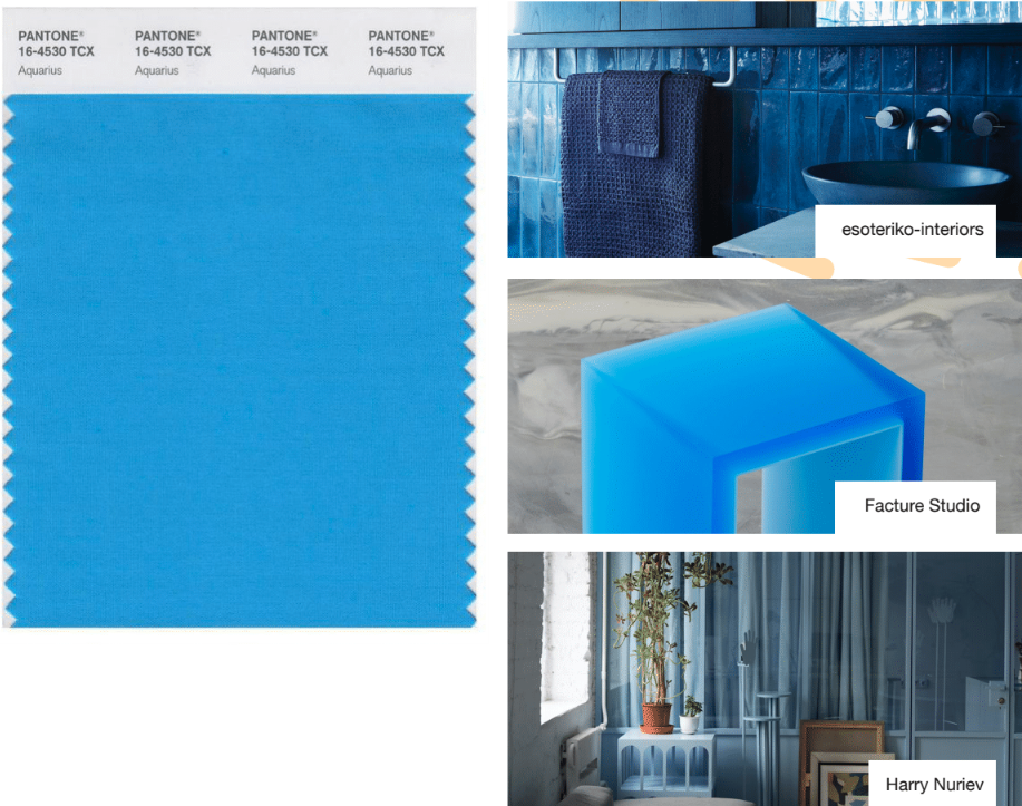
Chromatic Escape
Pantone: 16-4530 TCX
Blue always makes a bold splash, but get ready for a jolt of vibrancy that takes this classic hue into hyperdrive. This chromatic stunner evokes awe, escapism, and joy – everything residents crave. Its spirit of adventure transcends everyday blues and creates next-level, memorable experiences. This hyper-bright statement blue adds an unexpected excitement, allowing you to craft environments that feel new yet familiar at once.
- Use as an eye-catching accent color for branding elements and activated spaces.
- Complement with other bright statement tones to create an energetic color story.
- Add unexpected jolts of this color throughout floors or artworks to spark curiosity.
Future-Proofed Action Points
Look Beyond Trends: In the multifamily industry, aim for long-term success by crafting color strategies that transcend fads. Consider the timeless appeal of colors that can endure and remain relevant to your residents for years. By focusing on colors that evoke a sense of permanence, you’ll create spaces that stand out in a fast-changing market.
Feasibility Matters: While aesthetics are paramount, don’t neglect the practical aspect of color selection. Implement comprehensive feasibility checks to ensure your chosen colors harmonize seamlessly across diverse surfaces and materials within multifamily spaces. This meticulous attention to detail guarantees visual consistency and elevates the overall allure of your properties.
Embrace Sustainability: Showcase your commitment to environmental responsibility by opting for sustainable materials, processes, and natural or bio-based dyes in your color strategy. Embracing eco-conscious color choices attracts environmentally aware residents and positions your brand as a responsible and forward-thinking player in the industry.
Explore the Digital Landscape: The digital landscape significantly influences consumer decisions, even in the multifamily realm, when residents make crucial decisions regarding where to live. Harness the power of digital colors by experimenting with color palettes early in the brand positioning to see how they live in the digital space. Incorporating digital hues into your creative processes empowers you to refine your branding and marketing initiatives, ensuring visually captivating experiences that deeply resonate with your target audience.
As a leading research, design, and marketing agency, Uncomn Projects is ready to take your multifamily real estate brand to the next level. Our data-driven approach and team of experts provide you with a significant competitive advantage in the industry. By building a long-term color strategy that transcends seasonal trends, embraces sustainability, and harnesses the power of the digital landscape, we ensure your brand remains future-ready and ahead of the curve. Let’s envision the future of rental living together.