A printer proof is a preliminary version of a printed piece. It provides a close representation of how the piece will appear when printed. Proofs are created to ensure that the client and printer are in complete agreement on the desired outcome before going to press. Whether it is a simple flyer or a large-scale banner, it is important to review a printer proof carefully as a final safeguard against the costly mistake.
By reviewing this checklist before printing the final product, it will ensure that no errors will be overlooked and preventing you from reprinting. Given the prolonged complexity of the process, it would be efficient to hire an agency for this task.
If you decide to hire an agency, it is possible they will charge a print management fee for overseeing the process. Another benefit is that the agency would assume liability if the printing isn’t executed correctly. At Uncomn Projects, we oversee the process from start to finish making sure that your deliverables come out as expected.
1. Content
- Image accuracy and placement
- Are the photos used in line with your building’s brand?
- Do they represent the target demographic for future residents?
- Are they geographically accurate and show the city/neighborhood the building is in?
- If there are stock interior photos, are the fixtures and finishes generic enough that they will not be considered misleading to prospects
- Property details
- Are the floor plans labeled correctly? Do they have the correct SF, names, etc?
- Is the unit count correct?
- Are the residence features and community features all accurate and up to date?
- Contact information
- Property address
- Website URL
- Phone number
- Employee name(s)
2. Colors
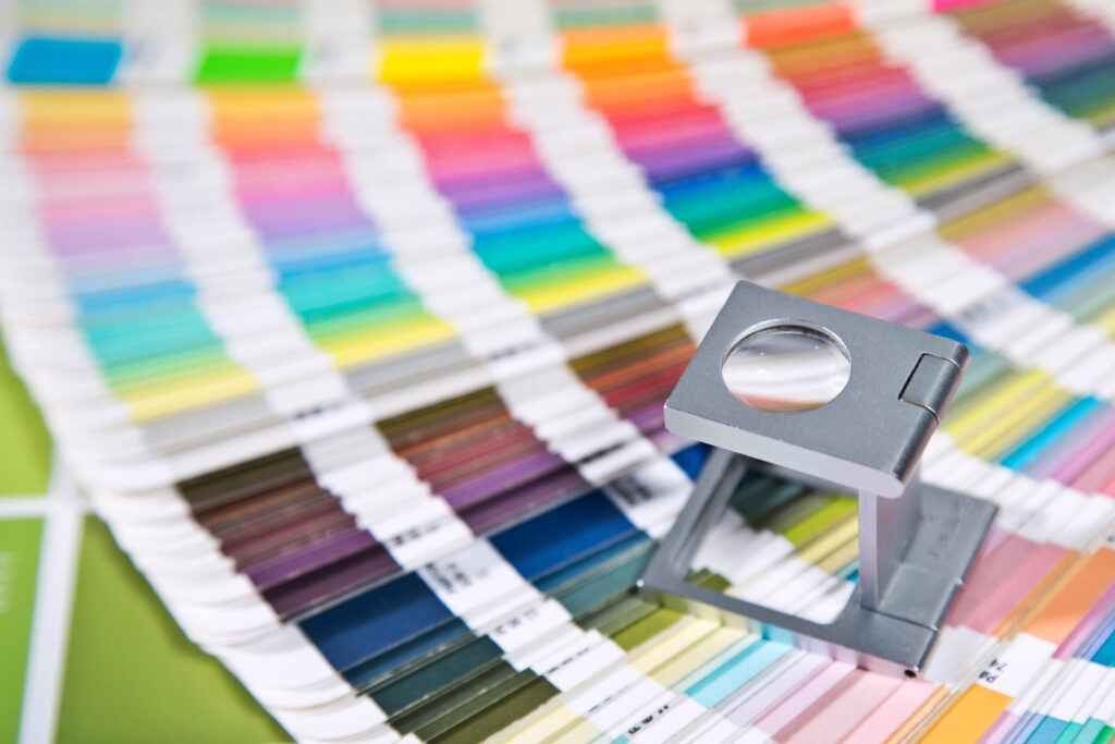
If your brand has an established color palette, you must make sure that the colors in the proof consistently reflect those that are included in the brand guidelines. Colors can appear differently on different computers, so it is always a good idea to send the PMS (Pantone matching system) color codes to your print vendor when printing an item so there is no confusion as to which colors should be used.
3. Spelling and Punctuation
Printers refer to any text included on a piece as “copy”. As elementary as this step sounds, you’d be surprised how many times spelling errors or missing commas can be overlooked in a piece’s copy even with rounds of review. It is always recommended to have multiple parties review proofs for spelling and punctuation and, if possible, to print out hard copies that can be compared side by side.
4. Fonts
Similar to the color palette, it is important to use established brand fonts. Having consistency throughout your visual brand elements creates a positive customer experience building trust and confidence in your brand. If necessary, you can always send your print vendor the fully packaged art files for the document, so they can view the names of the fonts used in the piece
Printer Proof Layout
5. Folds and Die Lines
- It is important to make sure images and copy are not going to be cut off or lost in the folded or glued areas of a piece. For precautionary measures, ask your graphic designer or print vendor to include die lines, which will show exactly where the folded lines will be, or to send you a physical proof so you can review the item in person.
- This is especially important for folders and envelopes.
6. Flat Size vs Final Folded Size
- If you are printing an item that will be folded it is important to note the difference between flat sizes and final folded sizes. For example, a brochure that is meant to have a final folded size of 8.5”x11” will have a flat size of 17”x11”.
- Brochures, pocket folders, and note cards are all common items that will have 2 sets of dimensions.
7. Bleed/Trim
All printer proofs should include a “bleed” margin that gives the printer a margin of error that can be critical during trimming the final product. Typically, the bleed is between .125″ and .25″ depending on the final product. Any content that is in the bleed area can be cut off during the trimming process. No integral information, especially letters in the copy, should be in the bleed area.
8. Layout and page positions
If you are printing an item with multiple pages, it is important to review the layout and page positions to make sure the piece follows the correct order.
9. A New Set of eyes
After reviewing these designs for weeks, it is suggested having a fresh set of eyes review the printer proof before you give your approval.
10. Quantity
It is always more cost-effective for a print vendor to produce items in bulk and you will receive certain price breaks when you print certain quantities. For example, the per piece price printing 50 pieces will be more expensive than printing 200 pieces. It is a good idea to ask your print vendor what these price breaks are if you are working within a limited budget.
For more information about how Uncomn Projects can help seamlessly oversee the printing process for you, click here or, email us at [email protected].


